You want your kitchen to look custom without emptying your savings or waiting 12 weeks for special-order cabinets, right? Same.
These smart kitchen cabinet layout ideas deliver that custom-built vibe while using stock, semi-custom, or budget-friendly pieces you can actually get and install. Think high-end finishes, better flow, smarter storage, and a few magic tricks the pros lean on all the time.
In This Article
- 1 Why these feel custom
- 2 1) L-shaped layout with a hardworking island
- 3 2) U-shaped with a feature wall
- 4 3) G-shaped with a peninsular return
- 5 4) Galley with symmetrical uppers
- 6 5) One-wall with a workhorse island
- 7 6) Tall pantry wall plus base-drawer run
- 8 7) Corner mastery: no dead zones
- 9 8) Ceiling-height uppers with a trim wrap
- 10 9) Mixed glass, open shelves, and a styled niche
- 11 10) Dedicated beverage or coffee bar zone
- 12 11) Semi-custom fronts on stock boxes
- 13 Micro-upgrades that sell the custom look
- 14 Smart storage equals a custom feel
- 15 Appliance placement that feels planned
- 16 Budget paths that still look luxe
- 17 Personal notes that actually help
- 18 Quick checklists by layout
- 19 Conclusion
Why these feel custom
Designers stick to a few core principles: clear work zones, symmetry where it matters, zero dead corners, and vertical lines that make a kitchen feel intentional. You can replicate all of that with smart layout moves, clever inserts, and a few tailored details—no bespoke millwork required, FYI.
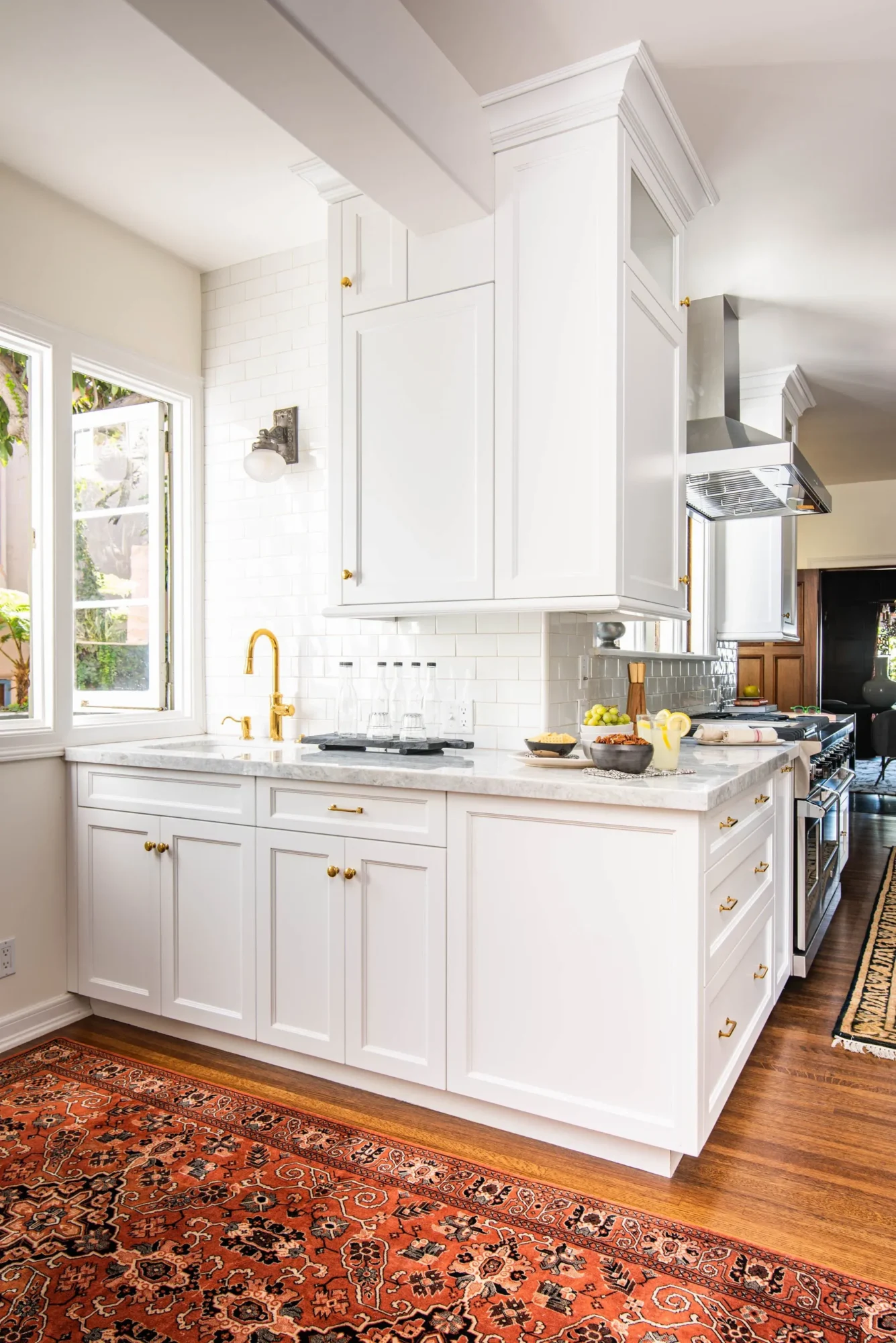
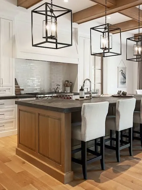
1) L-shaped layout with a hardworking island
The L-shaped layout keeps traffic smooth and zones intuitive, then the island adds prep space, storage, and seating that screams “custom.” Place the fridge on one leg, the range on the other, and keep the sink somewhere central to maintain an efficient triangle that doesn’t feel cramped. Add deep drawers in the island for pots and pans and consider a slim pull-out for oils next to the range for that pro touch.
- Key upgrades: deep drawers, pull-outs, and a trash/recycle combo under the island sink for a neat cleanup zone.
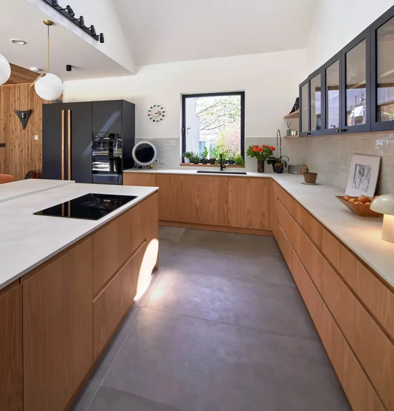
2) U-shaped with a feature wall

U-shaped kitchens feel built-in because three sides envelope the cook and maximize storage. To make it feel designer, create a focal wall at the closed end with a vent hood, slab backsplash, or glass uppers—small detail, big impact. If you’ve got the room, skip the island in smaller U’s to keep pathways clear; add a petite cart if you crave extra surface without committing to permanent cabinetry.
- Custom cue: a small-appliance “garage” in an upper cabinet keeps counters clean and the look dialed-in.
3) G-shaped with a peninsular return
Take a U and add a short return to create a G layout. That little extra run can host seating, a beverage center, or a baking zone. It uses almost every square foot and channels high-end custom kitchens, especially when you integrate corner solutions and clear work zones. Watch the entry width so it doesn’t feel claustrophobic—keep the opening comfortable for the main cook.
- Where it wins: tons of storage, specialized zones, and a built-in look without bespoke pricing.
4) Galley with symmetrical uppers
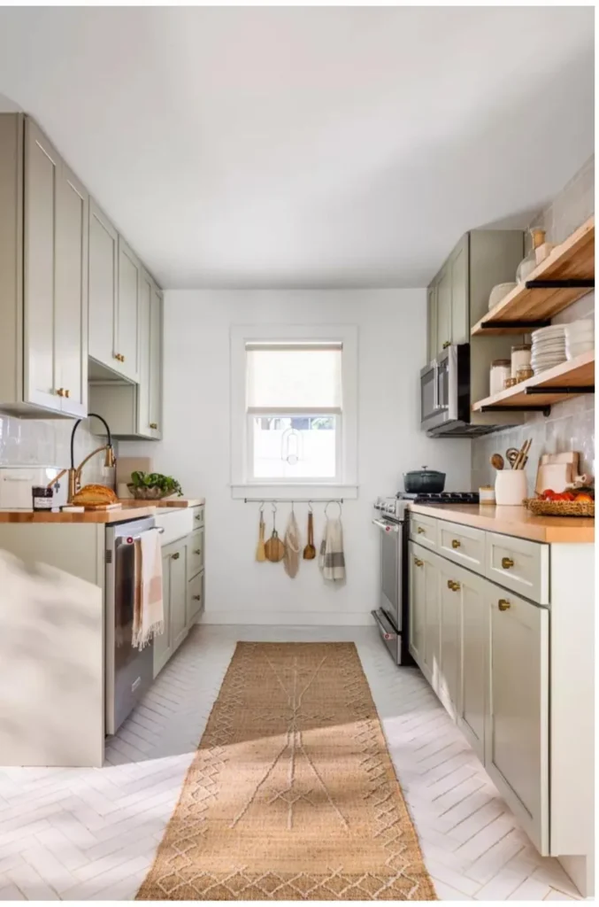
Galleys excel in small and medium spaces, and they can look seriously custom with balanced uppers and aligned sightlines. Keep prep on one side and cooking on the other to streamline movement, then mirror cabinet sizes left-to-right for calm, designer symmetry—center uppers over the sink or range for that “planned” look. Add pull-out pantries at one end to upgrade function and form.
Check Next: Stop the cabinet shuffle: 10 kitchen cabinet organization layout based on how you actually cook
- Symmetry trick: align verticals at the center (over sink/range) and let misalignments fall at the edges where no one notices, IMO.
5) One-wall with a workhorse island
If your kitchen runs along one wall, you can still fake a custom build with a multifunction island that handles prep, storage, and seating. Place the fridge at one end, the range centrally, and the sink near the island edge so the two surfaces work as a triangle across the aisle. Consider a cooktop on the island and wall oven on the run to keep guests engaged while you cook—designer move, zero attitude.
- Bonus: a slim appliance garage on the wall run keeps the backdrop sleek and “built-in”.
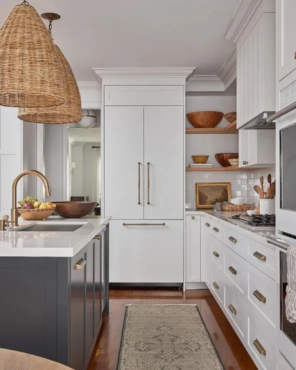
6) Tall pantry wall plus base-drawer run

Create a dramatic pantry wall with 84–90-inch towers—fridge, pantry, and broom closet—then run base cabinets with all drawers on the opposite side. Drawers feel high-end because they show everything at once and reduce bending like a champ. This duality (tall + drawers) looks custom because it balances vertical mass with horizontal rhythm.
- Pro choices: 18–24-inch modules instead of oversized boxes to keep categories tight and usable.
7) Corner mastery: no dead zones

Nothing screams “builder-basic” like a dead corner. Use a lazy Susan, blind-corner pull-outs, or diagonal corner cabinets to make every inch count, then match door styles across corners for a seamless look. When you treat corners like VIPs, the whole layout reads intentional—and yes, expensive.
- Why it matters: easy access + full utilization = custom energy without custom invoices.
8) Ceiling-height uppers with a trim wrap
Cap your stock uppers with a simple filler and crown to hit the ceiling. You’ll kill dust-catching gaps and add luxe vertical lines in one move. Wrap the ends with side panels and a matching toe-kick detail for that furniture-grade envelope designers love.
- Quick wins: crown molding, scribe trim, end panels, and upgraded hardware transform “stock” into polished.
9) Mixed glass, open shelves, and a styled niche

Mix a few glass-front doors or a small run of open shelves to break up heaviness and create a “curated” feel. Place glass near a feature zone—like over the coffee bar or beside the hood—so it frames a moment, not random dishes. Float two shelves where full uppers would feel bulky to keep light moving and show off your pretty things (yes, decanting counts).
- Budget-friendly: swap a few doors for glass inserts; it’s minimal effort for maximum glow-up.
10) Dedicated beverage or coffee bar zone

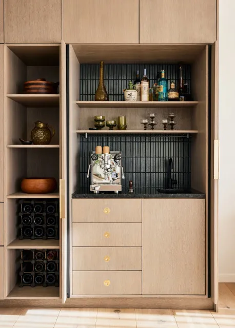
Want instant custom cred? Carve out a beverage center with a slim base, a drawer for pods or tea, and a glass upper. It looks like a purposeful add-on even when you build it from stock boxes. Add under-cabinet lighting and a small backsplash material change to signal “this is special” (because mornings deserve it).
- Layout tip: use the end of an L or the return of a G so traffic doesn’t tangle with cooking.
11) Semi-custom fronts on stock boxes
Use affordable stock or RTA boxes, then upgrade with better fronts, hardware, and inserts. You get a custom face with a sane budget—classic “style move” designers recommend when funds need to stretch. Finish with soft-close hinges, color-matched toe-kicks, and decorative end panels for a cohesive, tailored look.
- Reality check: RTA offers tons of styles; assembly trades time for savings, which many DIYers accept happily :).
Micro-upgrades that sell the custom look
Small details deliver disproportionate polish. Stack a few and your kitchen will fool everyone—maybe even you.
- Add crown, light rail, and scribe trim to clean every edge and hide gaps.
- Install soft-close hinges and full-extension, soft-close drawer slides for tactile quality.
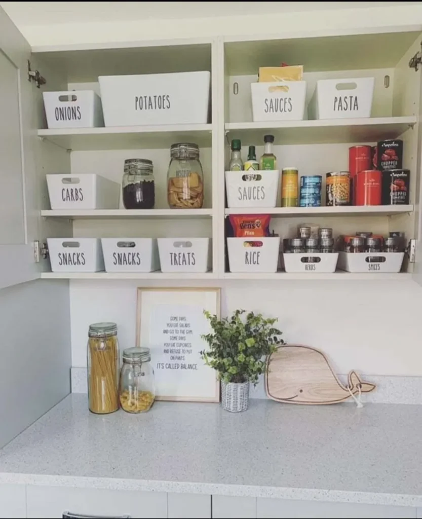
- Use integrated organizers—spice pull-outs, tray dividers, tiered cutlery—so every cabinet opens to a plan.
- Color-block or two-tone: darker bases, lighter uppers, or an accent island reads very designer.
- Run uppers to the ceiling and choose narrow cabinet widths to keep categories tight and tidy.
Smart storage equals a custom feel
No one admires a gorgeous kitchen that hides chaos. Build storage that works as hard as it looks.
- Pull-out shelves in base cabinets make bulky items easy to reach and keep you from crawling on the floor—ask your knees how they feel about that.
- Vertical tray dividers near the oven keep baking sheets and cutting boards upright and accessible.
- Deep drawers under a cooktop beat doors for pots and pans every single time.
- Pantry towers with adjustable shelves future-proof your storage as your gear changes.
Appliance placement that feels planned
Appliance chaos ruins good cabinetry. Use triangle logic and logical zones so everything makes sense at a glance.
- Keep fridge and range on opposite legs of a U or L, with a sink and dishwasher centered for flow.
- Avoid locating workstations right against doors or walkways to reduce collisions and mess.
- In island scenarios, consider cooktop on the island and wall oven in the run to face guests and spread heat sources.
Budget paths that still look luxe
You don’t need a custom order to get a custom vibe. Blend budget-friendly routes and spend where it shows.
- Stock boxes + upgraded doors + crown + hardware = most bang for buck.
- Repurpose furniture as a sideboard or coffee bar to add character and storage without matching sets.
- Add adhesive wallpaper or panel moldings to flat doors for texture and “bespoke-ish” detail, then color-block for extra attitude.
Personal notes that actually help
When I kit out a kitchen to feel custom, I start with tall storage and deep drawers, then I “frame” key moments: the hood wall, a coffee niche, and a glass-door pair for display. I cap uppers to the ceiling and align uppers over the sink and range for calm sightlines. I’ll pick 18–24-inch modules often; smaller widths keep everyone more organized because you naturally assign each cabinet a job (team less rummaging!). And yes, I install a lazy Susan or a proper blind-corner pull-out every single time—dead corners give me hives, TBH.
Quick checklists by layout
- L-shaped + island
- Triangle intact, trash near sink, pots in island drawers, pull-out oils near range.
- U-shaped
- Feature wall focal point, skip island if cramped, appliance garage to reduce clutter.
- G-shaped
- Use the return for seating or beverage zone, mind the entry width, maximize corners.
- Galley
- Mirror uppers for symmetry, put pull-out pantry at one end, keep paths clear.
- One-wall + island
- Cooktop or sink on island, wall oven on run, add light rail and under-cabinet lights for finish.
Conclusion
You can make stock or semi-custom cabinets look like a high-end, custom build with smart layout choices, vertical finishes, and the right inserts. Focus on work zones, kill dead corners, run uppers to the ceiling, and add a niche or two that feels personal—like a coffee bar or glass display—so the whole kitchen reads thoughtful and tailored, not templated. Start with one upgrade (drawers under the cooktop, crown molding, or a trim-wrapped pantry wall), then stack wins until the whole space aligns—no trust fund required, IMO.