Choosing a kitchen cabinet color can feel overwhelming—those little paint chips blur together, and yes, “Chantilly Lace” and “Simply White” do look different in daylight.
You want a timeless, versatile shade that feels fresh now and still beautiful years later. The wrong color can make your kitchen look cold, dark, or yellow, but the right neutral sets the stage for endless style updates.
I’ve rounded up the best Neutral Kitchen Cabinet colors that perfectly balance warmth, elegance, and practicality—your foundation for a fresh, lasting dream kitchen.
In This Article
- 1 1. The “Not-Quite-White” Warmth
- 2 Why You Need It
- 3 Top Paint Picks
- 4 2. Greige: The Ultimate Compromise
- 5 The Chameleon Effect
- 6 3. Mushroom and Putty Tones
- 7 Why It Feels Expensive
- 8 4. Light French Gray
- 9 Keeping It Fresh
- 10 5. Natural White Oak
- 11 Texture Over Color
- 12 6. Moody Charcoal
- 13 The Practical Choice
- 14 7. Classic Navy Blue
- 15 The “New” Black
- 16 8. Creamy Cashmere
- 17 The Nostalgia Factor
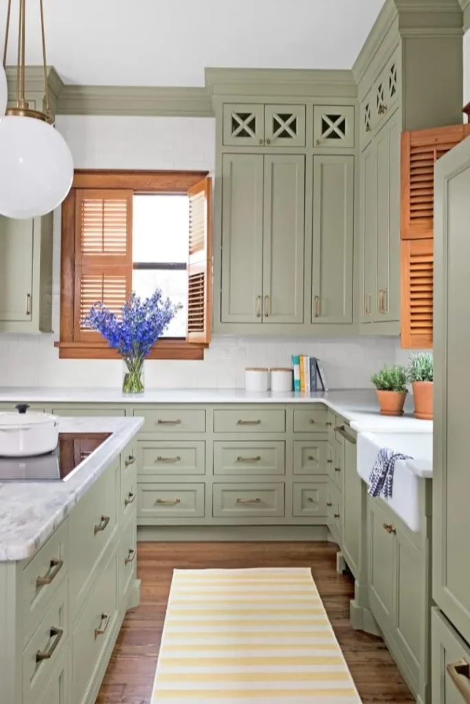
- 18 9. Sage Green
- 19 A Breath of Fresh Air
- 20 10. Matte Black
- 21 The Caveat :/
- 22 11. The Two-Tone Strategy
- 23 Visual Balance
- 24 How to Test Your Neutrals Before Committing
- 25 Hardware: The Jewelry for Your Neutrals
- 26 Summary
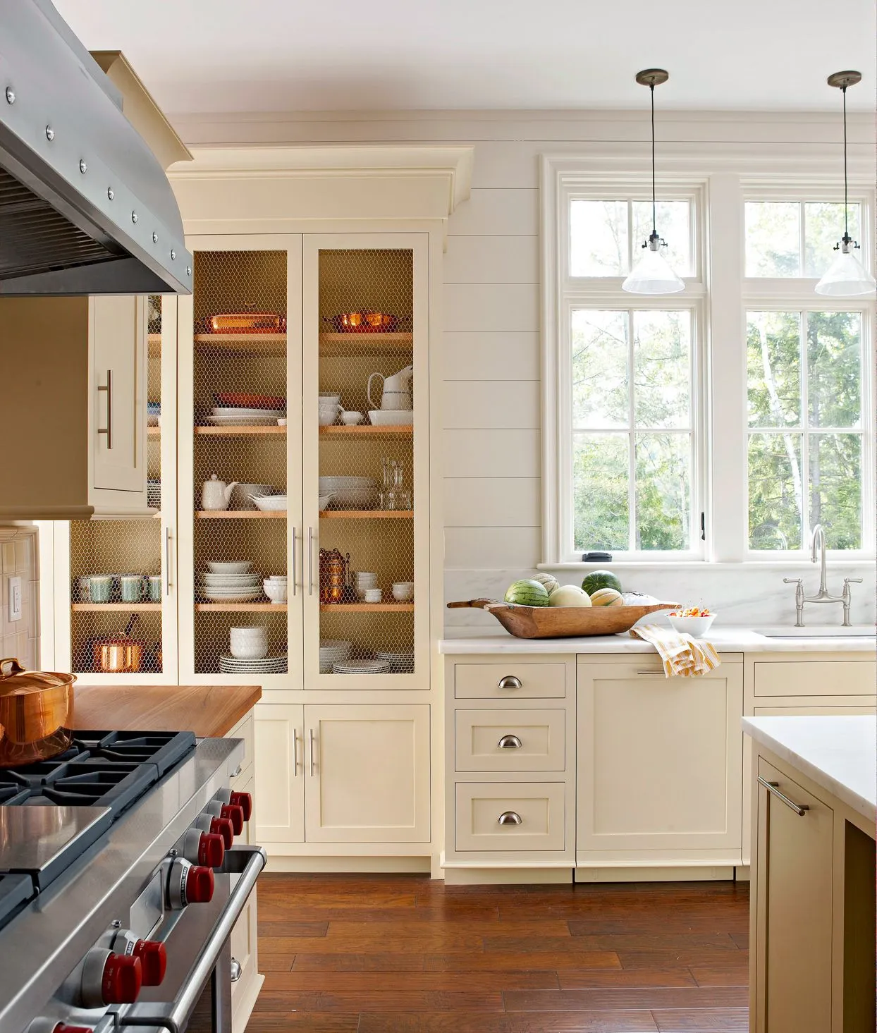
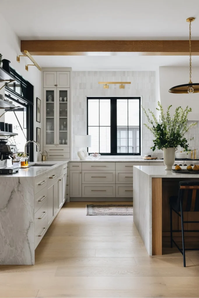
1. The “Not-Quite-White” Warmth
Pure, stark white cabinets had their moment. But honestly? They often feel like a hospital operating room. Warm whites are the superior choice. They carry a creamy, soft undertone that makes your kitchen feel inviting rather than clinical.
Why You Need It
Warm white reflects light beautifully but adds a layer of coziness that bright white lacks. It pairs exceptionally well with natural wood floors and brass hardware. If you love the “clean girl aesthetic” but actually cook spaghetti sauce occasionally, this is for you.
Top Paint Picks
- Benjamin Moore Swiss Coffee: This is the holy grail of warm whites. It has just enough creamy depth to look expensive.
- Sherwin Williams Alabaster: A true neutral white that doesn’t lean too yellow.
FYI: If your kitchen lacks natural light, warm white prevents the space from feeling cold and gray.
2. Greige: The Ultimate Compromise
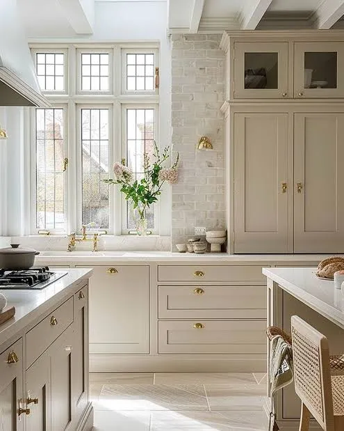
Can’t decide between gray and beige? Don’t. Choose Greige. It literally solves the biggest argument in interior design. It possesses the sleekness of gray but brings the warmth of beige.
The Chameleon Effect
I love greige because it changes based on the time of day. In the morning sun, it looks fresh and airy. By candlelight (or just your under-cabinet LEDs), it turns moody and rich. It works with cool marble countertops and warm butcher block islands.
Why it works:
- Hides dirt: Unlike white, greige camouflages fingerprints and dust.
- Versatility: It bridges the gap between modern and traditional styles.
3. Mushroom and Putty Tones
Move over, gray. Mushrooms are taking the spotlight. Think of this as Greige’s earthier, sophisticated cousin. It draws inspiration from nature, resembling the color of raw linen or smooth river stones.
Why It Feels Expensive
Mushroom cabinets scream “custom kitchen.” They look incredibly high-end because they possess a depth that flat colors lack. I see this color everywhere in high-end English cottage designs.
Pair these cabinets with:
- Unlacquered brass hardware (it looks stunning against the earthy backdrop).
- Soapstone or dark quartz countertops.
4. Light French Gray
If you want to keep things cool and crisp, light gray remains a solid contender. Specifically, look for grays with a slight blue undertone. They feel airy and reminiscent of a Parisian apartment.
Keeping It Fresh
Light gray acts as a fantastic alternative to white. It provides enough contrast against white walls to make your millwork pop, but it doesn’t darken the room.
Warning: Watch out for purple undertones. Test your paint samples on the wall before committing! You don’t want a lavender kitchen unless that’s your specific vibe.
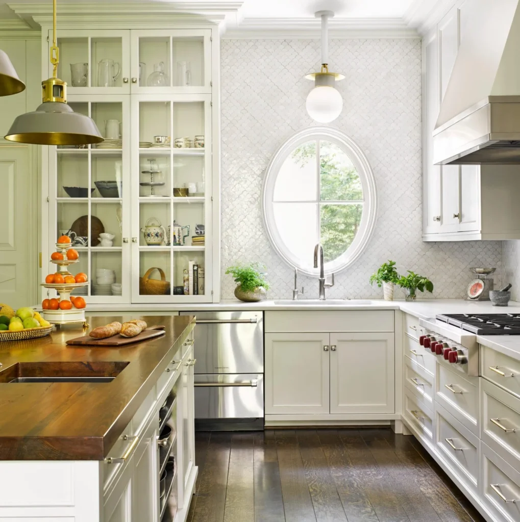
5. Natural White Oak
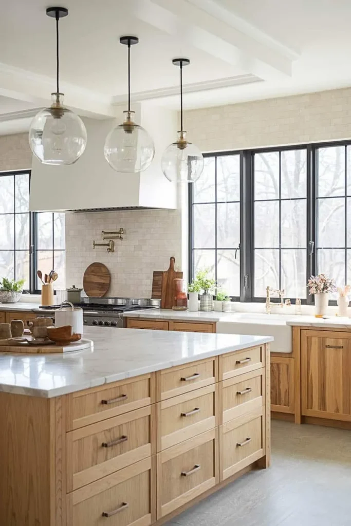
Okay, this isn’t a paint color, but it is absolutely a neutral “color” choice. Natural wood cabinets—specifically white oak—are dominating Pinterest right now for a reason. They bring texture that paint simply cannot replicate.
Texture Over Color
We spent the last decade painting over beautiful wood. Now, we are stripping it back. A clear matte sealer on white oak keeps the wood looking raw and organic.
Must Check: 10 Modern Neutral Kitchen Design Ideas That Will Never Go Out of Style
Design Tip: If doing an entire kitchen in wood feels like a cabin overload, mix it up. Use wood for the island and painted cabinets for the perimeter. It breaks up the monotony.
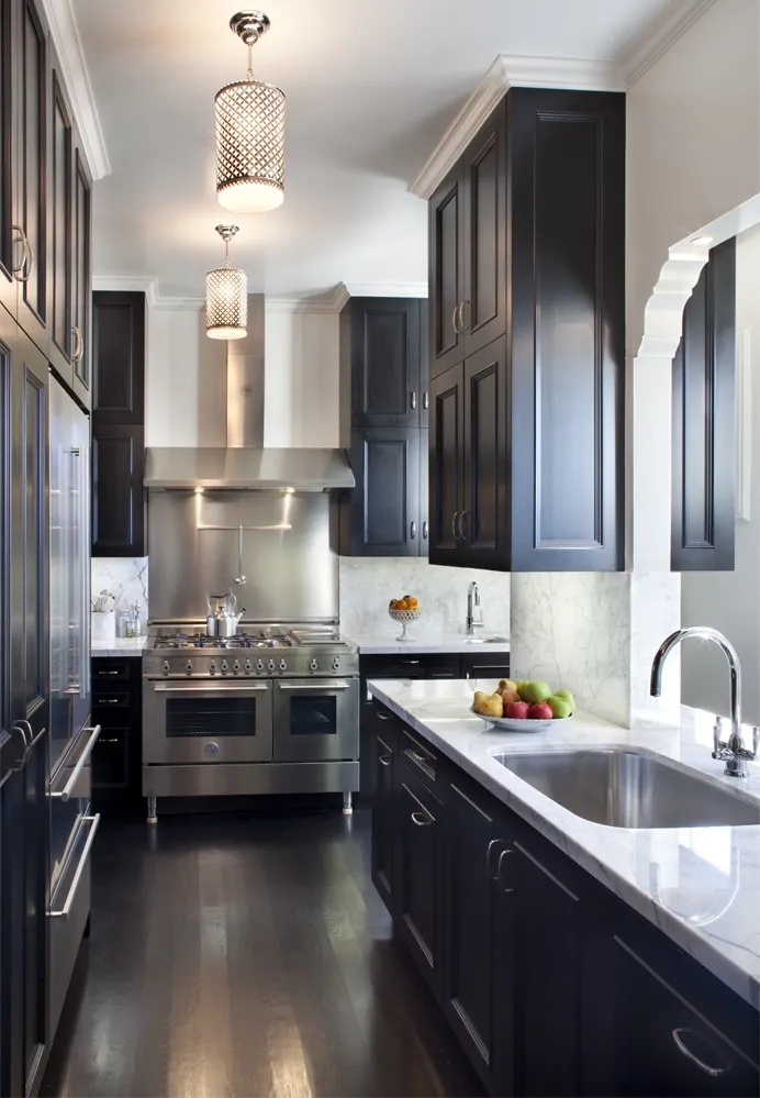
6. Moody Charcoal
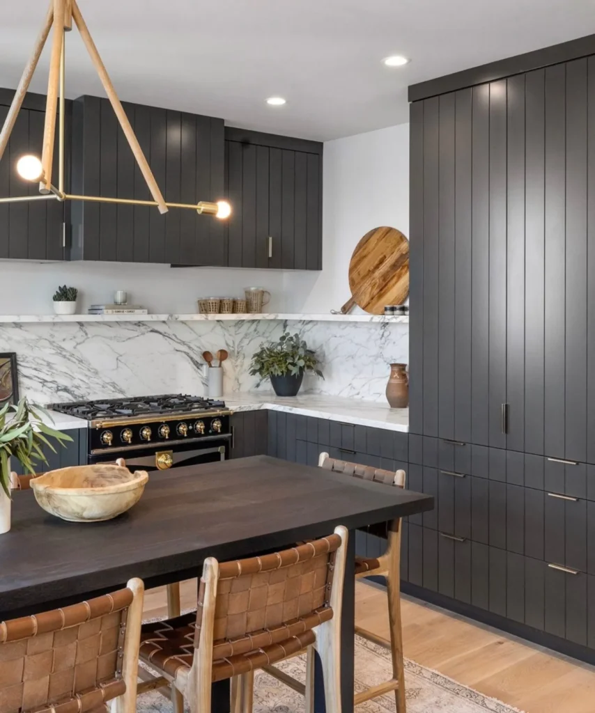
Who said neutral has to be light? Charcoal gray acts as a powerful neutral. It provides drama and anchors the room without the harshness of jet black.
The Practical Choice
Let’s be honest: kitchens get messy. Charcoal cabinets hide scuffs, splashes, and general wear and tear better than almost anything else.
Styling Charcoal:
- Use plenty of under-cabinet lighting to keep it from feeling like a cave.
- Pair with light countertops (like white marble or quartz) to create striking contrast.
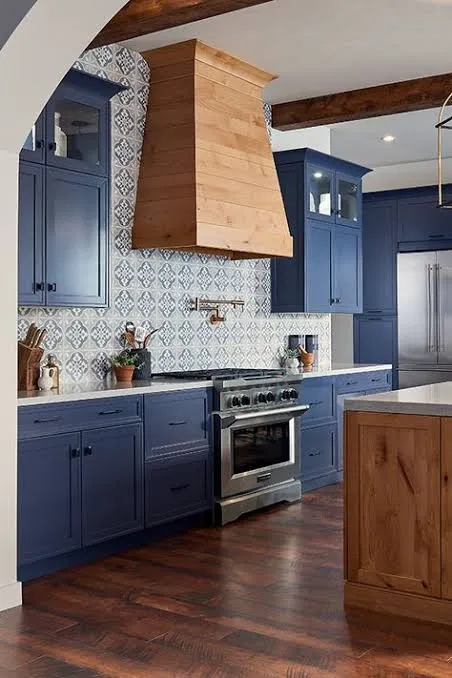
“Wait,” you ask, “is blue a neutral?” IMO, yes. Navy blue functions exactly like a pair of dark wash jeans. It matches everything. It pairs with white, wood, gold, silver, red, green—you name it.
The “New” Black
The Navy brings color into space without feeling risky. It feels traditional and nautical but can skew modern depending on your hardware.
Where to use it:
- The Island: A navy island in a white kitchen is a classic look that never fails.
- Lower Cabinets: Keep the uppers white and paint the lower navy for a grounded look.
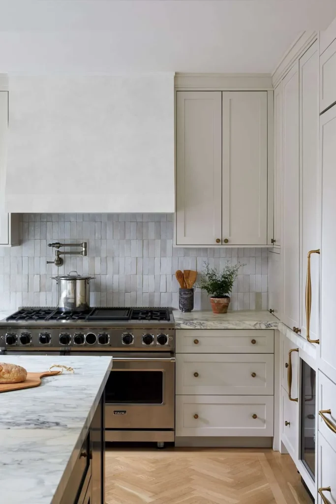
8. Creamy Cashmere

Think of this as the color of a really expensive latte. Cashmere or deep cream cabinets offer a vintage, soulful vibe. This isn’t the yellow-cream of the 90s; it’s a muted, stone-like beige.
The Nostalgia Factor
This color works wonders in kitchens with vintage details like beadboard or shaker styling. It feels lived-in and comfortable from day one.
You Might Like: 10 Warm Neutral Kitchen Ideas That Will Instantly Make Your Home Feel Cozier
Best Pairing: Dark bronze hardware looks incredible against creamy cabinets. It adds a little industrial edge to the softness.
9. Sage Green
Like the navy, Sage Green sits firmly in the “nature’s neutral” category. Think of dried eucalyptus or sage leaves. Because green appears so frequently in nature, our eyes read it as a background color, not a loud accent.
A Breath of Fresh Air
Sage feels calming. It reduces stress (and we all need that when we burn dinner). It works particularly well in smaller kitchens, bringing life to the space without overwhelming it.
Try this:
- Sherwin Williams Clary Sage: A soft, herbal green that isn’t too minty.
- Benjamin Moore October Mist: A silver-green that looks very sophisticated.
10. Matte Black
If you possess a bold streak, Matte Black cabinets serve up major drama. This is the tuxedo of kitchen cabinets. It is sharp, tailored, and undeniably sexy.
The Caveat :/
I love the look, but I have to warn you: matte black shows greasy fingerprints like crazy. If you have toddlers (or messy partners), keep a microfiber cloth handy.
Why do it anyway? Because it looks incredible. It makes metallic hardware pop like jewelry. It defines the space and makes ceilings look higher by drawing the eye down.
11. The Two-Tone Strategy

Can’t pick just one? The Two-Tone look is your best friend. This usually involves painting the upper cabinets a light neutral (like white or cream) and the base cabinets a darker neutral (like charcoal, navy, or wood).
Visual Balance
This strategy tricks the eye.
- Light Uppers: Blend with the ceiling, making the room feel taller and more open.
- Dark Lowers: Anchor the room and hide the dirt where the most traffic happens.
It gives you the best of both worlds. You get the airy feel of a white kitchen with the personality of a colorful one.
How to Test Your Neutrals Before Committing
You wouldn’t buy a car without a test drive. Don’t buy 5 gallons of cabinet paint without testing it.
Here is my foolproof method:
- Buy Samplize sheets or paint large poster boards.
- Tape them to your existing cabinets.
- Watch them for 24 hours. Look at them with your morning coffee. Look at them while you cook dinner. Look at them with the lights off.
Undertones are tricky beasts. A gray might look blue in the morning and purple at night. A white might look yellow next to your backsplash. Testing saves you from expensive regrets.
Hardware: The Jewelry for Your Neutrals
Neutral cabinets act as the little black dress; the hardware is the statement necklace. Since your color choice is safe, you can go wild here.
- Brass/Gold: Warms up cool grays and crisp whites.
- Matte Black: Adds a modern, graphic punch to wood or cream cabinets.
- Polished Nickel: Offers a timeless, jewelry-like sparkle that works with everything.
Summary
Choosing a neutral doesn’t mean you are playing it safe; it means you are playing it smart. Whether you go for the moody depth of charcoal, the organic texture of white oak, or the classic reliability of warm white, you are building a canvas.
These 11 ideas offer longevity. They won’t date your kitchen like that trendy bright orange everyone loved in 2005.
So, grab a coffee, order some samples, and trust your gut. Your kitchen is the heart of your home—make sure it beats with a rhythm you love.