Many people think “neutral” equals boring beige boxes, but that couldn’t be further from the truth. Neutral palettes are actually the secret weapon for small spaces.
When done right, they erase visual boundaries, bounce light around like a disco ball (a classy one), and make a tiny footprint feel airy and expensive.
I’ve spent years analyzing kitchen trends, and I can tell you that maximizing a small footprint is all about tricking the eye. We are going to explore 11 Small Neutral Kitchen Ideas to Maximize Space and Lightdesign strategies that turn a cramped cooking zone into a spacious sanctuary.
Grab a coffee, and let’s fix that layout.
In This Article
- 1 1. Embrace High-Gloss Finishes
- 2 The Zellige Tile Effect
- 3 2. The “Tuxedo” Cabinet Strategy
- 4 Best Color Pairings
- 5 3. Swap Solids for Glass Cabinet Fronts
- 6 A Warning for the Messy
- 7 4. Layer Your Lighting (Stop Using One Bulb!)
- 8 5. Continuous Flooring for Flow
- 9 Direction Matters
- 10 6. The “Invisible” Hardware Trick
- 11 7. Vertical Storage and Open Shelving
- 12 Styling is Key
- 13 8. Tone-on-Tone Textures
- 14 9. The Appliance Garage (Hide the Tech)
- 15 10. Match Your Backsplash to Your Countertop
- 16 11. Ditch the Heavy Curtains
- 17 Final Thoughts
1. Embrace High-Gloss Finishes
Matte finishes have had their moment in the sun, but if you are dealing with a tiny kitchen, you need to rethink that trend. Reflective surfaces are your best friend.
Why does this work? It’s simple physics. Glossy tiles, polished countertops, or even high-gloss lacquer cabinets act like mirrors. They bounce natural and artificial light around the room, instantly making the space feel deeper and more open.
The Zellige Tile Effect
If high-gloss cabinets feel too “dentist office” for you, try Zellige tiles for your backsplash. These handmade Moroccan tiles have an uneven, pearlescent texture that catches light beautifully.
- Reflects Light: The glaze shimmers without being blinding.
- Adds Texture: It stops a neutral white kitchen from looking sterile.
- Easy Clean: Despite the texture, the glaze wipes down easily.
I once swapped a client’s matte subway tile for a glossy, pearlescent alternative, and the room looked twice as big immediately.
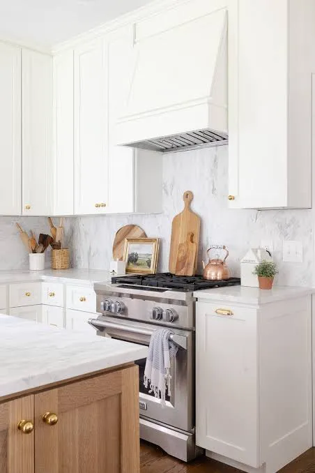
2. The “Tuxedo” Cabinet Strategy
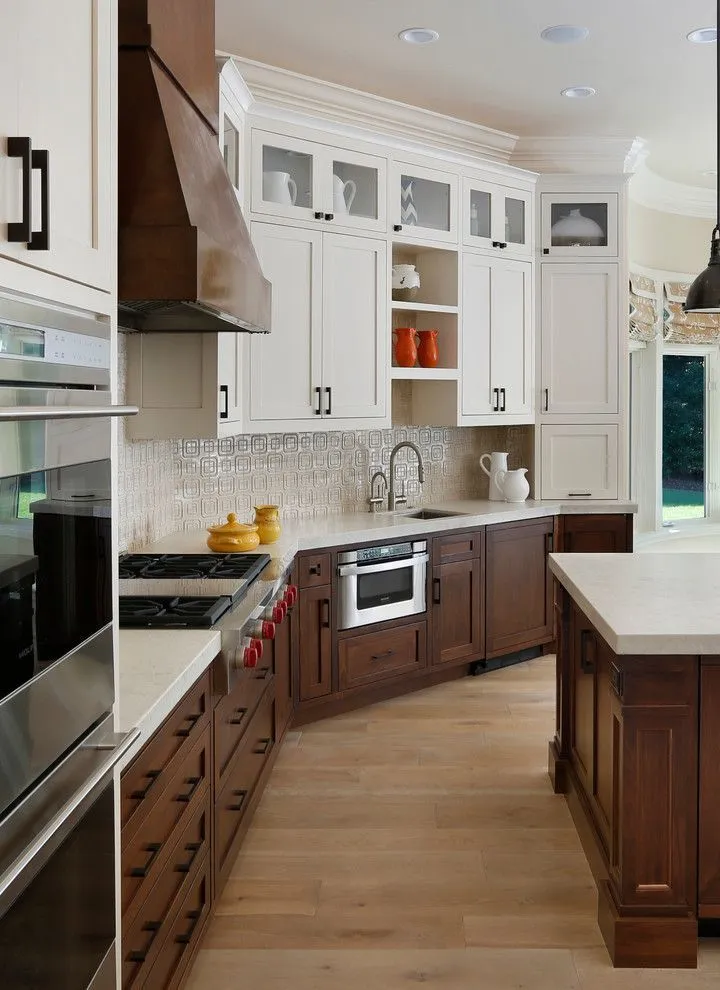
You might be afraid of dark colors in a small space, but you don’t have to banish them entirely. The “Tuxedo” look involves painting your lower cabinets a darker neutral (like charcoal, taupe, or deep greige) and keeping the upper cabinets white or cream.
This technique grounds the space. It draws the eye upward toward the lighter color, creating an illusion of height. If you paint everything dark, you’re cooking in a cave. If you paint everything white, you might feel like you’re in a hospital. This balance is the sweet spot.
Best Color Pairings
- Warm Greige Bottoms + Creamy White Tops: Keeps things cozy, not stark.
- Navy/Charcoal Bottoms + Crisp White Tops: A classic coastal look that feels expensive.
- Natural Oak Bottoms + White Tops: Brings in warmth without the visual weight of paint.
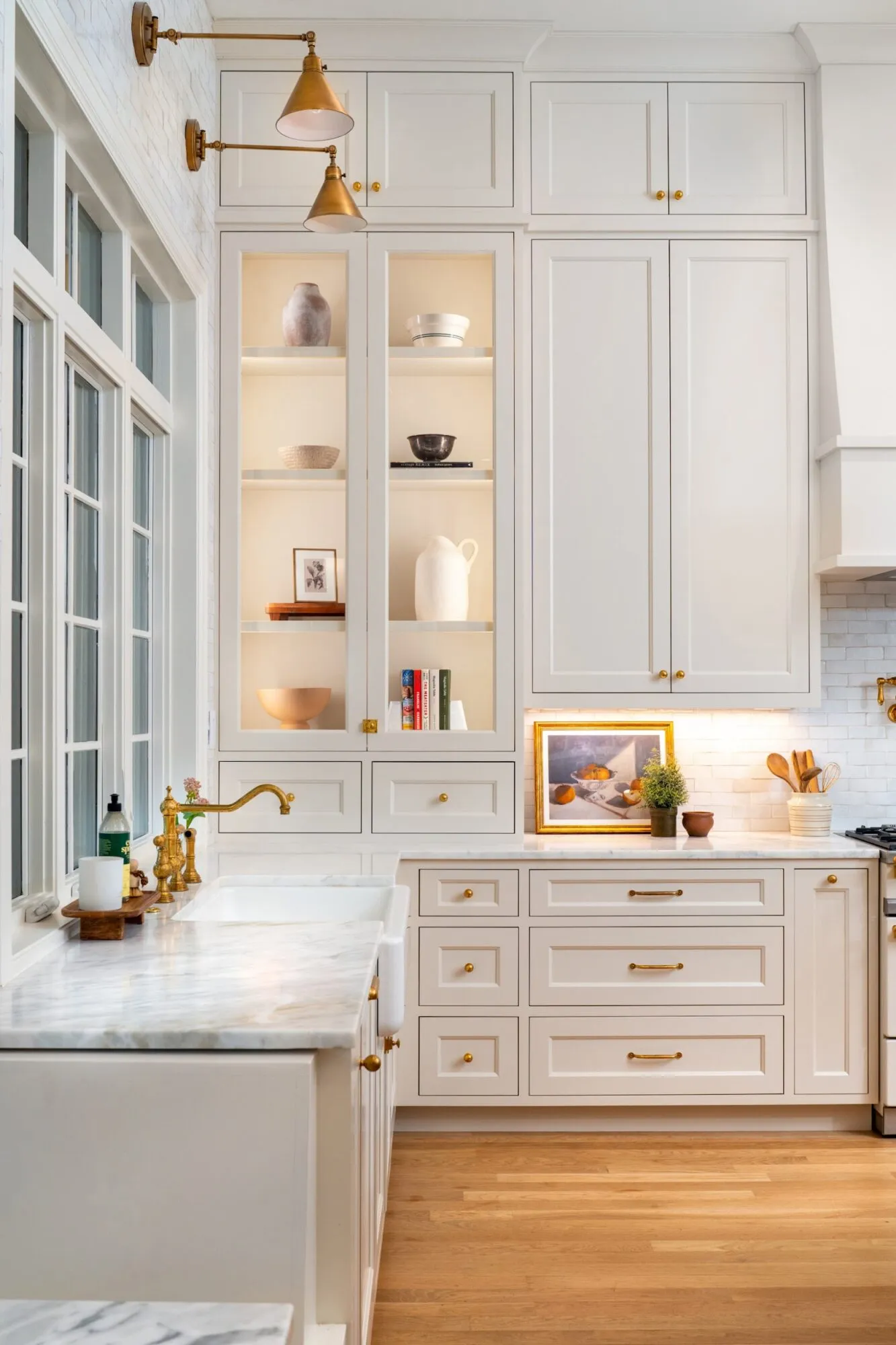
3. Swap Solids for Glass Cabinet Fronts
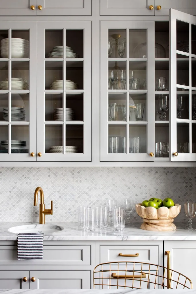
Solid cabinet doors are essentially walls. When you have a wall of them in a narrow galley kitchen, the room closes in on you. Replacing a few key doors with glass inserts breaks up that monotony and adds depth.
By letting the eye travel into the cabinet, you extend the visual line of the room by another 12 inches. It sounds like a small trick, but the psychological effect is huge.
A Warning for the Messy
This only works if you keep your dishes organized. If your cupboards look like a Tupperware explosion, frosted or reeded glass is a better option. It gives you the airy feeling without putting your chaotic mug collection on display. IMO, reeded glass is the most stylish option right now—it adds texture and hides the clutter.
4. Layer Your Lighting (Stop Using One Bulb!)

Nothing shrinks a room faster than shadows in the corners. A single ceiling boob light (you know the one I mean) casts harsh shadows and leaves the perimeter dark. To maximize space, you must illuminate the edges.
You need three layers of light to make a neutral kitchen pop:
- Ambient: Recessed cans or a semi-flush mount to light the floor.
- Task: Under-cabinet lighting is non-negotiable. It lights up the work surface and eliminates shadows.
- Accent: Sconces above a window or open shelf add character and draw the eye up.
When you light up the backsplash and the corners, the walls seem to push back, creating that spacious feel we are chasing.
5. Continuous Flooring for Flow
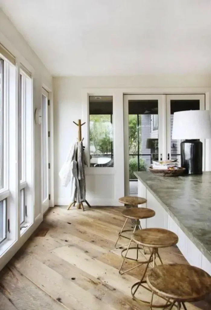
Visual breaks on the floor act like stop signs for your eyes. If you have tile in the kitchen that meets hardwood in the living room, you are visually chopping up the floor plan.
Must Check:
Run the same flooring from the living area into the kitchen. This blurs the lines between zones, making the kitchen feel like an extension of the larger living space rather than a tiny, isolated box.
Direction Matters
If you are laying down planks (wood or luxury vinyl), run them parallel to the longest wall. This acts like an arrow, guiding the eye and stretching the room. If you prefer tile, consider a large-format light stone. Fewer grout lines mean less visual clutter.
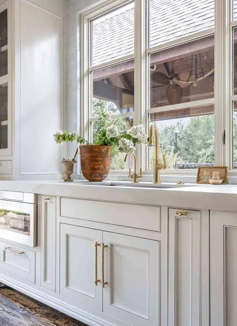
6. The “Invisible” Hardware Trick
Hardware is the jewelry of the kitchen, but in a small space, big chunky handles can clutter up the view. Clutter makes spaces feel smaller.
Consider integrated finger pulls, push-to-open latches, or sleek edge pulls that match the cabinet finish. When the hardware disappears, you get a clean, uninterrupted line of cabinetry. This is especially effective in modern, neutral kitchens where you want the texture of the materials to do the talking.
If you absolutely love hardware (I get it, brass is pretty), keep it slender and minimal. Avoid oversized knobs that catch your pockets every time you walk by. :/
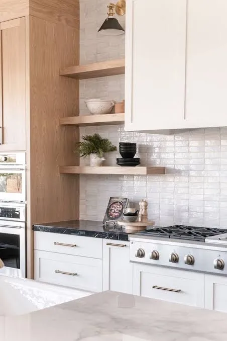
7. Vertical Storage and Open Shelving
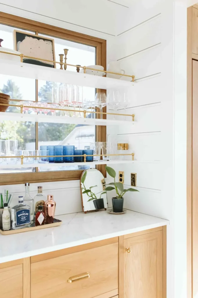
I know, open shelving is controversial. The dust struggle is real. However, in a small neutral kitchen, removing a block of upper cabinets near the window or stove opens up the room significantly.
Open shelves create negative space. They allow light to filter through areas that would otherwise be blocked by a heavy wooden box.
Styling is Key
Don’t use these shelves for your ugly protein shakers. Use them for:
- Matching white dishware (keeps the neutral theme).
- Clear glassware (reflects light).
- A single wooden cutting board (adds warmth).
If you keep the color palette on the shelves cohesive with the walls, the items blend in rather than standing out as clutter.
8. Tone-on-Tone Textures
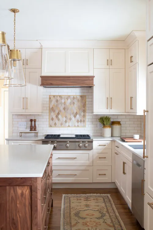
Since we are skipping bold colors, we have to avoid the room looking flat. Texture is the antidote to boredom in a neutral space.
Related:
You want to layer different materials in the same color family. Think of a creamy white kitchen:
- The Walls: Matte cream paint.
- The Splash: Glossy white subway tile.
- The Counter: White quartz with subtle grey veining.
- The Accents: A linen window shade and a bleached wood fruit bowl.
Your eye picks up on these subtle differences, creating richness and interest without the visual chaos of high-contrast colors. It feels sophisticated and calm, which is exactly what a cramped space needs.
9. The Appliance Garage (Hide the Tech)
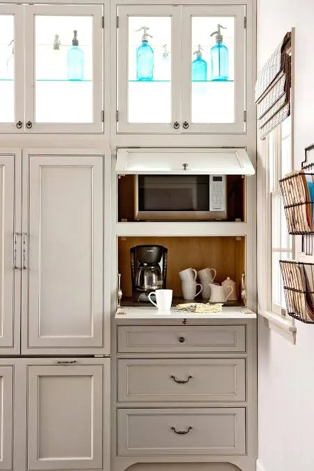
Counter space is premium real estate. Nothing kills the vibe of a serene, neutral kitchen like a black air fryer, a stainless toaster, and a nest of cords cluttering the workspace.
Designate a cabinet as an appliance garage. This could be a lift-up cabinet door at counter level or a pantry shelf with an outlet installed in the back. By getting the small appliances off the counter, you maximize the usable “white space.”
Ever wondered why show-home kitchens look so huge? It’s because there isn’t a coffee maker in sight. Clear counters equal a clear mind and a bigger-looking room.
10. Match Your Backsplash to Your Countertop
This is one of the most effective tricks in the book for expanding space. Instead of having a counter color, and then a totally different tile color, carry your countertop material up the wall as the backsplash.
This is often called a “slab backsplash.” By removing the horizontal line where the counter meets the wall, you create a seamless vertical flow. It draws the eye up without interruption.
If a full slab of Quartz or marble is out of budget (it hurts my wallet just thinking about it), just ensure your tile color is an exact match to your countertop base color. The goal is continuity.
11. Ditch the Heavy Curtains
Natural light is the number one factor in how big a room feels. If you have a window in your kitchen, do not—I repeat, do not—choke it with heavy blinds or dark curtains.
Leave the window bare if privacy allows. If you have neighbors staring at you while you make your morning coffee, opt for a sheer roman shade or a light-filtering roller blind mounted inside the window frame.
- Inside Mount: Keeps the wall surface clean and uncluttered.
- Light Colors: White or linen shades blend into the walls.
The more sky you can see, the less boxed-in you will feel. It’s a free upgrade that changes everything.
Final Thoughts
Designing a small neutral kitchen isn’t about compromising; it’s about being smarter than the square footage you were given. By using reflective surfaces, strategic lighting, and cohesive colors, you trick the brain into perceiving space that isn’t technically there.
Start with one or two of these changes—maybe swap out that boob light or paint your upper cabinets white—and watch how the room breathes a sigh of relief. You’ve got this!