
Struggling with decision paralysis in the paint aisle? Unlike throw pillows, kitchen cabinets are a long-term commitment, making color choice terrifying. The designer secret is simple: go neutral. A timeless backdrop allows you to swap decor easily and boosts resale value.
I’ve compiled nine foolproof Neutral Kitchen Colors Schemes that are anything but boring. Whether you’re gut-renovating or simply repainting existing cupboards, these palettes offer the perfect, stress-free foundation for a stylish and versatile space.
In This Article
- 1 1. The “Texture-Over-Color” White Scheme
- 2 Why It Works
- 3 The DIY Execution
- 4 2. The Modern Greige (Gray + Beige)
- 5 The “Mushroom” Trend
- 6 Pairing It Up
- 7 3. The Tuxedo Kitchen (Black & White)
- 8 Visual Anchoring
- 9 Choosing Your Black
- 10 4. Navy Blue and White
- 11 The Coastal-Chic Vibe
- 12 Hardware Matters
- 13 5. Sage Green and Natural Wood
- 14 The “Organic Modern” Mix
- 15 6. Cream and Walnut
- 16 Why It’s Foolproof
- 17 How to Style It
- 18 7. Charcoal and Soapstone
- 19 The Edge
- 20 Preventing the “Cave” Effect
- 21 8. Taupe and Brass
- 22 The “English Cottage” Look
- 23 9. The “Sand and Sea” (Driftwood & Pale Blue-Gray)
- 24 Who This Is For
- 25 Execution
- 26 The “Foolproof” Rules for DIY Success
- 27 1. Test, Don’t Guess
- 28 2. The Finish Matters
- 29 3. Contrast is King
- 30 4. Hardware is the Easiest Upgrade
- 31 Final Thoughts
1. The “Texture-Over-Color” White Scheme
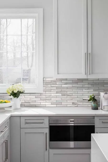
We have to start with the classic. But I’m not talking about that sterile, hospital-operating-room look where you need sunglasses just to make coffee. I mean a layered, warm white palette. The trick here isn’t the color itself; it’s the texture.
Why It Works
White reflects light, making even a tiny galley kitchen feel massive. But flat white feels cheap. You need to mix materials. Think creamy white cabinets paired with a zellige tile backsplash (those glossy, uneven tiles that catch the light) and perhaps a white quartz counter with faint veining.
The DIY Execution
- Cabinet Paint: Look for warmer whites like Benjamin Moore’s White Dove or Sherwin Williams’ Alabaster. These have yellow undertones that prevent the room from feeling cold.
- Hardware: Use matte black or oil-rubbed bronze. The high contrast stops the room from floating away.
- The flooring: This demands a medium-tone wood floor to ground the space. If you have tile floors, throw down a vintage runner rug.
Pro Tip: If your cabinets are currently that 1990s honey oak, painting them a warm white instantly updates the house value. Just make sure you sand them properly first—don’t skip the prep!
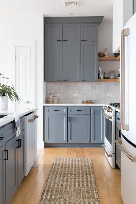
2. The Modern Greige (Gray + Beige)
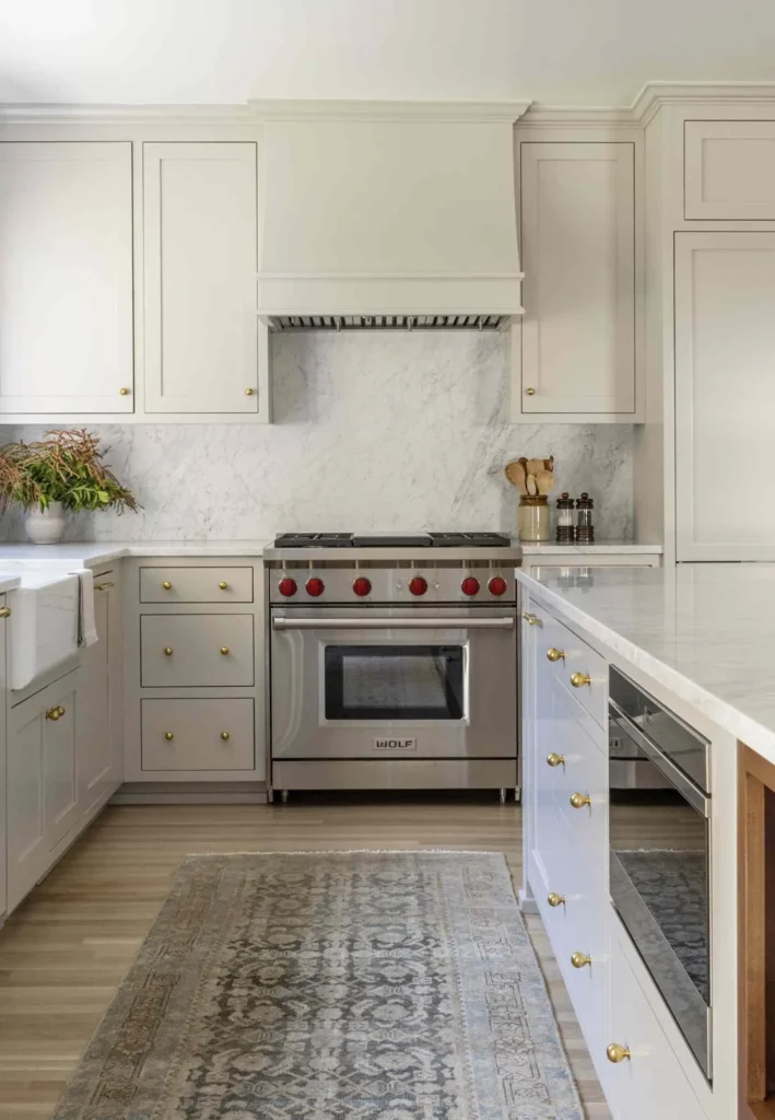
Greige is the Switzerland of colors—it stays neutral in every conflict. It isn’t quite gray, and it isn’t quite beige. It sits right in the middle, pulling the best traits from both. Ten years ago, everyone painted everything cool gray. Now, we crave warmth.
The “Mushroom” Trend
You might see this labeled as “Putty” or “Mushroom” on Pinterest. It feels organic and earthy. I personally love this because it hides dirt way better than stark white. If you spill a little tomato sauce or your dog shakes mud everywhere, greige offers a bit of forgiveness. 🙂
Pairing It Up
- Counters: Crisp white marble or quartz looks expensive against greige cabinets.
- Metals: This color loves polished nickel or unlacquered brass.
- Walls: Keep the walls a crisp white (like SW Pure White) to let the cabinetry stand out as the main feature.
3. The Tuxedo Kitchen (Black & White)
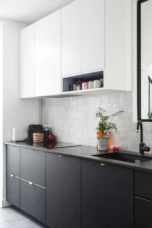
Do you want drama without the risk? Go for the tuxedo look. This scheme uses black (or very dark charcoal) on the lower cabinets and white on the upper cabinets.
Visual Anchoring
This works specifically because dark colors feel “heavy.” By putting the black on the bottom, you ground the room. By keeping the uppers white, you keep the sightlines open and airy. It tricks the eye into thinking the ceilings are higher than they actually are.
Choosing Your Black
Don’t just grab a can of “Black.” You want a soft black.
- Sherwin Williams Tricorn Black: A true, neutral black without blue undertones.
- Benjamin Moore Cheating Heart: A deep, smoky charcoal that feels softer than pure black.
Warning: Black cabinets show dust and water spots. If you hate wiping down surfaces, skip this one. But IMO, the sophisticated look is worth the extra five minutes of cleaning.
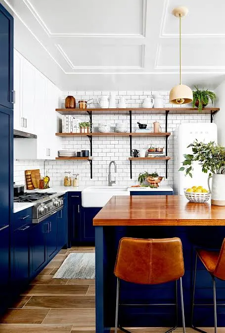
“Wait,” I hear you ask, “is blue a neutral?” In the design world, the navy functions as a neutral. Think about your closet. Blue jeans go with literally everything, right? The same logic applies to your kitchen.
The Coastal-Chic Vibe
A deep navy island paired with white perimeter cabinets creates a focal point that feels intentional but safe. It gives you a pop of personality without screaming for attention. This scheme pairs beautifully with butcher block countertops, bringing in a nautical, Hamptons-style aesthetic.
Hardware Matters
The Navy demands brass or gold hardware. The warmth of the gold against the cool deep blue creates a vibration that looks incredibly high-end. Silver or chrome can sometimes look a bit cold here, so I suggest leaning into the warm metals.
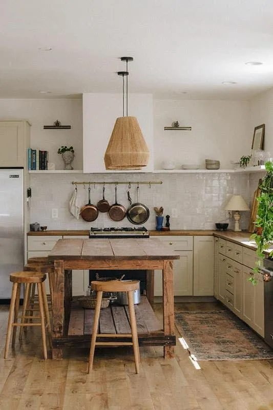
5. Sage Green and Natural Wood
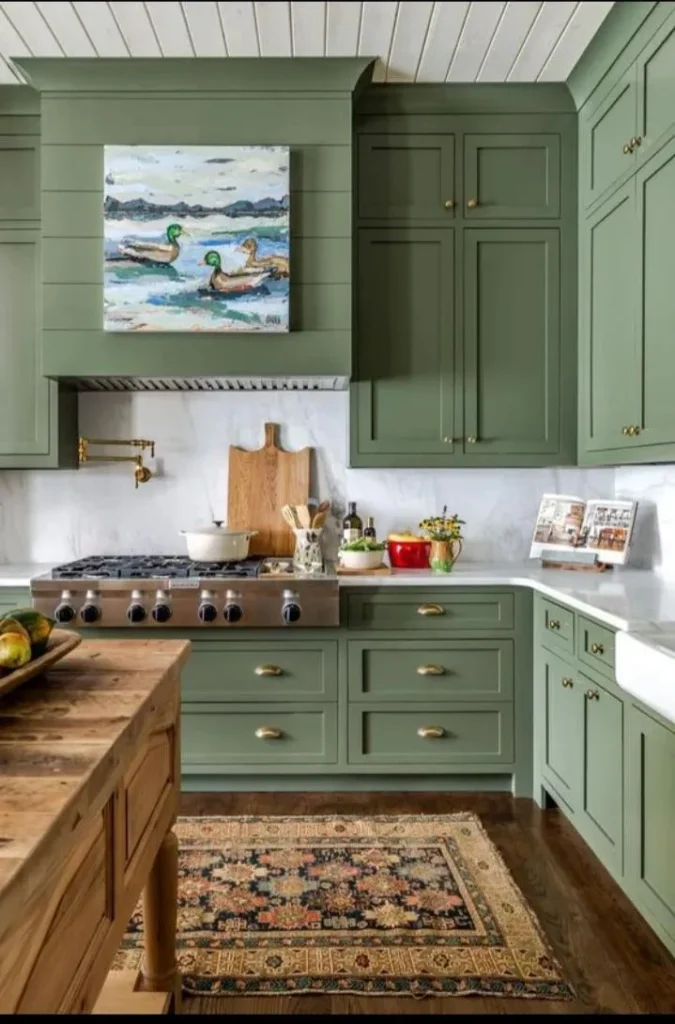
Biophilic design (bringing the outdoors in) is huge right now. A soft, muted sage green acts as a neutral because it mimics the colors of nature. It’s calming, restorative, and looks absolutely killer with natural wood tones.
The “Organic Modern” Mix
If you have wood cabinets that are in good shape but feel outdated, consider painting just the island sage green. Or, strip the finish off your upper cabinets to reveal the raw wood (sealed with a matte topcoat, of course) and paint the lower cabinets green.
- The Palette:
- Paint: Farrow & Ball Pigeon or SW Evergreen Fog.
- Accents: Terracotta pots, wooden cutting boards, and woven light fixtures.
- Backsplash: Keep it simple with a creamy subway tile.
This scheme feels like a breath of fresh air. It’s impossible to feel stressed in a sage green kitchen.
6. Cream and Walnut
Move over, bright white. Cream is back, and it brought its rich friend, Walnut, along for the ride. This combination screams “Mid-Century Modern” but in a soft, approachable way.
Why It’s Foolproof
Stark white and dark wood can sometimes look harsh or dated (looking at you, early 2000s espresso cabinets). Cream softens the transition. It bridges the gap between the dark wood grain and the rest of the room.
How to Style It
Use walnut for your island or open shelving. Paint the main cabinetry a rich cream like BM Swiss Coffee. This color has a high reflective value but holds a warm, velvety undertone. Add some mid-century pendant lights, and you suddenly look like you hired an architect.
Design Note: If real walnut cabinets are outside the budget, look for high-quality vinyl wraps or veneers. You can achieve this look for a fraction of the cost if you get creative.
7. Charcoal and Soapstone
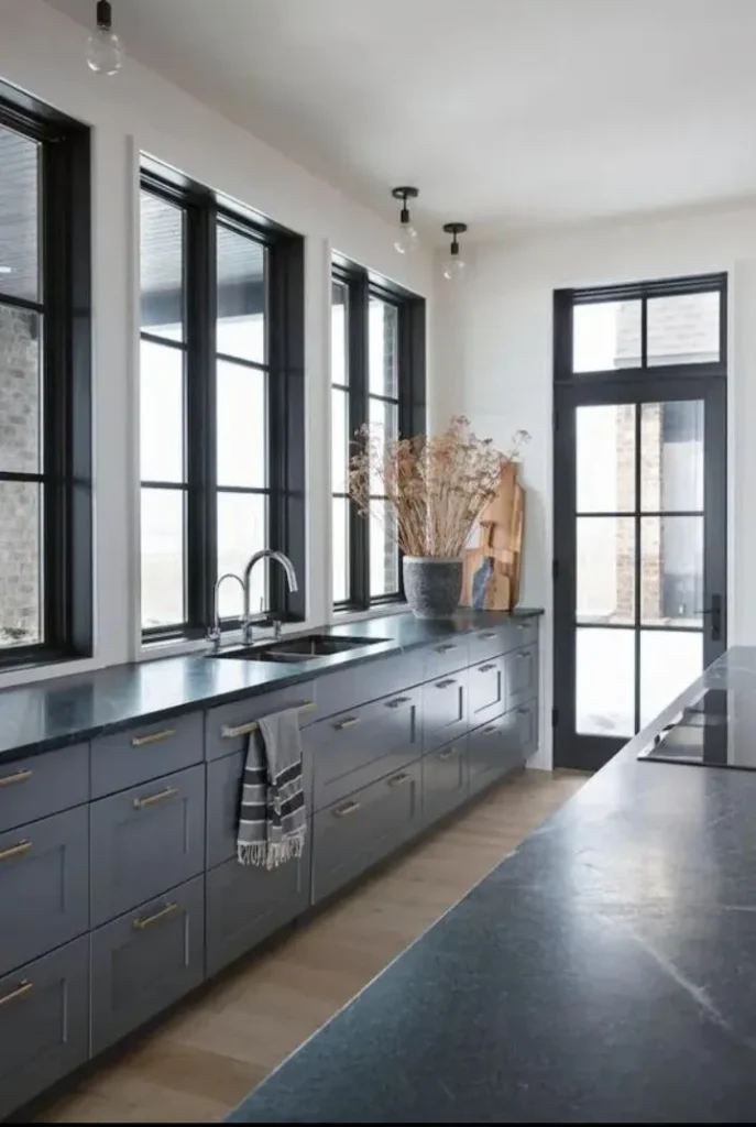
For those who prefer a moody, industrial aesthetic but want to keep it neutral, monochrome gray is the answer. But we aren’t doing boring builder-grade gray. We are doing deep charcoal.
The Edge
Paint your cabinets a dark, stormy gray (like BM Kendall Charcoal). Pair this with soapstone countertops. Soapstone is a natural stone that feels silky to the touch and has a matte, almost leather-like appearance. It doesn’t scream for attention like a shiny granite; it just sits there looking confident.
Preventing the “Cave” Effect
To ensure this doesn’t feel like a dungeon:
- Lighting: You need excellent under-cabinet lighting.
- Backsplash: Use a white or very light gray grout with your backsplash tile to add a graphic pop.
- Floors: Keep the flooring light—a light oak or a pale stone tile works best to bounce light back up.
8. Taupe and Brass
Taupe is the sophisticated older sister of beige. It has purple or pink undertones that make it feel luxurious and warm. When you pair taupe cabinetry with unlacquered brass hardware, you get a kitchen that looks distinctly European.
The “English Cottage” Look
This scheme dominates Pinterest right now for a reason. It feels lived-in and cozy.
- The Paint: Try SW Accessible Beige (which reads as a light taupe in many lights).
- The Bling: Brass faucets and drawer pulls act as jewelry. Over time, unlacquered brass develops a patina that looks vintage and authentic.
Style Tip: Add a vintage runner rug with reds and faded blues. The taupe cabinets provide the perfect quiet background for a patterned rug to shine.
9. The “Sand and Sea” (Driftwood & Pale Blue-Gray)
This is the lightest, airiest scheme on the list. It combines very pale, driftwood-toned wood (like white oak or bleached pine) with the whisper of a blue-gray paint.
Who This Is For
If you have a small kitchen with limited windows, this scheme is your savior. It mimics the colors of a beach on a cloudy day. It expands the visual space significantly.
Execution
- Cabinets: Pale blue-gray (like BM Boothbay Gray cut at 50% strength).
- Flooring/Shelves: Light white oak.
- Countertops: A pure white quartz or a concrete-look laminate.
This palette feels incredibly clean. It promotes a sense of minimalism without feeling barren.
The “Foolproof” Rules for DIY Success
Picking the scheme is only half the battle. You have to put the paint on the wood without losing your mind. Here are my non-negotiable rules for DIYers tackling these schemes.
1. Test, Don’t Guess
Never—and I mean never—buy five gallons of paint based on a chip the size of a postage stamp. Paint looks different in your kitchen than it does in the store.
- Buy a sample pot.
- Paint a large piece of poster board.
- Tape it to your cabinet.
- Look at it in the morning, noon, and night (with the lights on).
- Why? That lovely “warm white” might turn pink under your specific LED bulbs. You need to know that before you sand all your doors.
2. The Finish Matters
For cabinets, you generally want a Satin or Semi-Gloss finish.
- Flat/Matte: Hides imperfections but is a nightmare to clean. Grease sticks to it like glue.
- High Gloss: Easy to clean but highlights every single dent and scratch in your wood.
- Satin: The sweet spot. It glows, it cleans up well, and it looks professional.
3. Contrast is King
A neutral kitchen fails when everything matches too perfectly. If your walls, cabinets, counters, and floors are all the exact same shade of beige, you live in a cardboard box.
You must vary the tones. If the cabinets are dark, make the counters light. If the cabinets are white, add a wood element or dark hardware. Contrast creates interest.
4. Hardware is the Easiest Upgrade
If you can’t afford to paint the cabinets right now, swapping the hardware changes the color scheme more than you think. Putting matte black handles on honey oak cabinets instantly makes them look more modern industrial. Putting glass knobs on white cabinets makes them look vintage. It’s the cheapest renovation you will ever do.
Final Thoughts
Designing a kitchen feels heavy because the kitchen is the heart of the home. It’s where you argue over whose turn it is to do dishes, where you doom-scroll while waiting for the microwave, and where you actually cook occasionally.
You want it to feel like you.
Any of these nine neutral schemes provides a safety net. They are proven combinations that balance warmth, light, and style. They allow you to bring in your personality through the cheap stuff—rugs, tea towels, and pottery—while the expensive stuff (cabinets and counters) stays timeless.
So, grab a sample pot of “Greige” and get to work. You’ve got this. Just maybe hire a babysitter for the weekend you decide to sand the doors. Trust me on that one. :/