Let’s be real: we’ve all spent a late night scrolling through kitchen remodels, judging someone’s 1990s orange oak cabinets while hovering over a bowl of cereal in our own “fixer-upper.” The kitchen is the undisputed heart of the home, but if yours feels more “cluttered cave” than “culinary oasis,” it’s time for some serious eye candy.
I’ve rounded up 10 transformations that prove you don’t always need a million-dollar budget to get a high-end look. Whether it’s a splash of daring paint or a total layout overhaul, these glow-ups are pure motivation.
In This Article
- 0.1 1. From “Stuck in the Stone Age” to Contemporary Chic
- 0.2 2. The High-End Glow Up: Black & Gold
- 0.3 3. Lightening the Load
- 0.4 4. Injecting Character into a “White Box”
- 0.5 5. Sophistication via Structural Tweaks
- 0.6 6. Solving the “Cramped & Chaos” Problem
- 0.7 7. The “Blueberry” Makeover: Balancing Wood
- 0.8 8. Smart Shelving for Small Spaces
- 0.9 9. Dark Granite to Bright Subway Tile
- 0.10 10. Bold Blue and Modern Vibes
- 1 The Takeaway?
1. From “Stuck in the Stone Age” to Contemporary Chic
The Before: This kitchen was drowning in heavy stone walls and tiles that looked like they’d seen one too many disco nights. The dark wood island and dim lighting made the whole room feel heavy and, frankly, a bit sad.
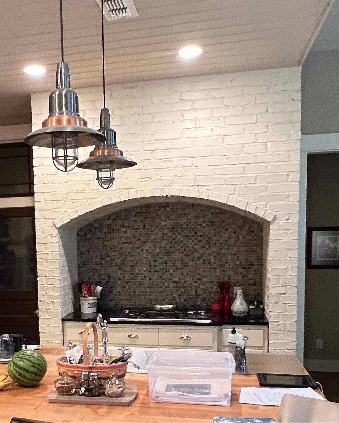
The After: Instead of ripping everything out, the owners kept the stone wall but swapped the dated backsplash for something sleek.
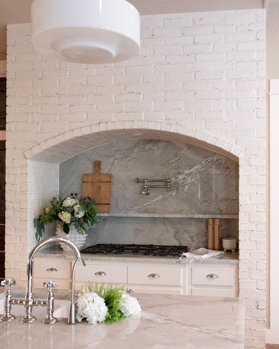
- The Secret Sauce: A marble-topped island and bright lighting.
- Why it works: It balances rustic “cabin vibes” with modern luxury without losing the home’s original character.
2. The High-End Glow Up: Black & Gold
The Before: It wasn’t “bad,” just… boring. A standard, functional kitchen that had zero personality. It was the “plain vanilla” of interior design.

The After: Hello, drama! By switching to black cabinetry and gold hardware, this space went from “meh” to “millionaire.”

- Pro Tip: Gold accents are the jewelry of the kitchen. Use them on faucets and pulls for an instant expensive feel. 🙂
3. Lightening the Load
The Before: Dark wood cabinets can sometimes make a kitchen feel like a sauna (and not in a relaxing way). This space felt enclosed and cramped thanks to the “wood-on-wood” crime being committed.
The After: White cabinetry saved the day. By keeping a few subtle rustic elements but painting the bulk of the room in airy tones, the kitchen suddenly feels three times larger. Natural light actually has a surface to bounce off of now!

4. Injecting Character into a “White Box”
The Before: You know those all-white kitchens that feel a bit like a dental office? This was one of them. Spacious? Yes. Inspiring? Not even a little.
The After: A bold coat of paint on the lower cabinets and some cozy bar stools turned this sterile lab into a family hub.
- My Take: If your kitchen feels “blah,” a colorful island is the easiest way to fix it without a full demo.
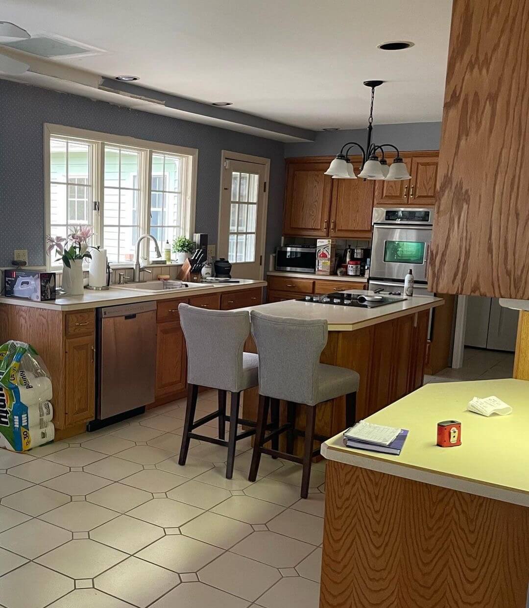
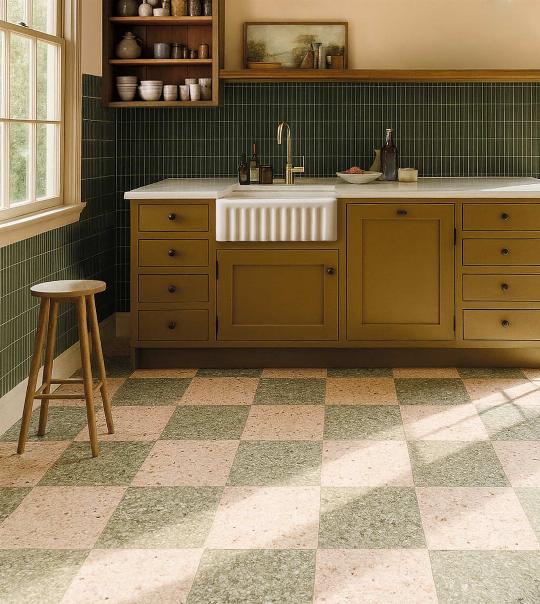
5. Sophistication via Structural Tweaks
The Before: A functional layout that just felt “flat.” It lacked contrast, and a random door was eating up precious real estate.
The After: They ditched the unnecessary door to gain counter space and added gold-accented cabinetry. The stained wood floors provide a gorgeous contrast to the bright tops. It’s proof that sometimes, removing a feature is better than adding one.

6. Solving the “Cramped & Chaos” Problem
The Before: Mismatched tiles and zero prep space. It was a visual headache that made cooking feel like a chore.
The After: By sticking to a palette of beige and light oak, the room looks incredibly organized.

- Key Move: They maximized natural light to make the small footprint feel limitless. It’s a literal breath of fresh air.
7. The “Blueberry” Makeover: Balancing Wood
The Before: Too. Much. Wood. It was like living inside a cedar chest. Even if you love nature, there’s a limit, guys.
The After: Two-tone cabinetry for the win! Light blue lowers paired with open shelving broke up the monotony.
:max_bytes(150000):strip_icc()/studiopeakeopenshelving2-69a6cc39016040d89710b0aa4726a830.jpeg)
- Style Note: Adding blue gives it a Mediterranean flair that feels timeless rather than trendy.
8. Smart Shelving for Small Spaces
The Before: A tiny kitchen with an awkwardly placed stove. It was the ultimate “one person at a time” kitchen.
The After: They swapped heavy upper cabinets for open shelving.

- Why I love this: It makes the walls “recede,” making the room feel wider. Plus, a funky backsplash adds just enough “pop” to keep it interesting.
9. Dark Granite to Bright Subway Tile
The Before: Heavy, dark granite countertops and chunky cabinets were “the look” in 2005, but today? They just make a room feel closed in.
The After: Sleek white cabinets and subway tiles. It’s a classic combo for a reason—it never goes out of style and reflects every bit of light available. They also added pull-out organizers, because hidden storage is the ultimate flex.

10. Bold Blue and Modern Vibes
The Before: Muted colors and worn-out floors. It looked tired and ready for a nap.
The After: Deep navy cabinets and modern hardware. It’s a moody, sophisticated look that still feels energetic. Large windows were the MVP here, ensuring the dark cabinets didn’t turn the room into a cave.
:strip_icc():format(webp)/bright-kitchen-navy-blue-statement-cabinets-2d4f897d-9519b0855998412b97e8b06829a80bc8.jpg)
The Takeaway?
You don’t need to move houses to get the kitchen of your dreams. Most of these transformations relied on a few key pillars:
- Lightening the palette (White and beige are your best friends).
- Updating hardware (Gold or matte black works wonders).
- Mixing textures (Wood + Marble + Metal).
- Embracing color (Don’t be afraid of a blue or green island!).
So, if you’ve been sleeping on your remodel plans, now’s the time to wake up and give it a shot. Your morning coffee will taste approximately 100% better in a room you actually like looking at. Trust me—you’ll thank yourself later. 😉