I used to think all-white kitchens were the pinnacle of design, but now I’m obsessed with the drama of darker hues. Painting a room black feels risky—like you’re building a bat cave—but balancing it with warm textures creates pure magic. Put down the panic bag! I’m sharing my top Black and Neutral Kitchen Ideas to help you achieve this cozy, expensive, and high-contrast look without overwhelming your space.
In This Article
- 1 Why This Look Is Taking Over (And Why You Should Care)
- 2 Picking Your “Black”: It’s Not One-Size-Fits-All
- 3 The Warm Blacks vs. The Cool Blacks
- 4 The Finish Matters More Than You Think
- 5 The Cabinetry Strategy: To Tuxedo or Not to Tuxedo?
- 6 The Full Commit (All Black)
- 7 The Tuxedo Kitchen
- 8 Countertops: The Bridge Between Dark and Light
- 9 Marble and Quartz with Veining
- 10 Butcher Block
- 11 Backsplash: Don’t Let It Compete
- 12 The Zellige Tile Option
- 13 The Slab Backsplash
- 14 Warming It Up: The “Neutral” Part of the Equation
- 15 Wood Tones are Non-Negotiable
- 16 Metals and Hardware
- 17 Lighting: Do Not Ignore This
- 18 Layer Your Lighting
- 19 Styling: The Finishing Touches
- 20 Texture Over Color
- 21 Common Mistakes to Avoid (Learn From My Failures)
- 22 Budget-Friendly Ways to Get the Look
- 23 Final Thoughts: Be Bold
- 24 What’s Next?
Why This Look Is Taking Over (And Why You Should Care)
We need to talk about why this trend works so well. It’s not just because some influencer said so. It works because contrast creates interest. Our eyes naturally look for focal points, and nothing demands attention quite like a wall of matte black cabinetry against a warm oak floor.
The “moody” aesthetic adds instant sophistication.
Think about a tuxedo. It looks good on everyone, right? The same logic applies here. Black grounds the space. It anchors the room. When you pair it with neutrals—creams, beiges, natural woods—you soften that harsh edge. You aren’t building a dungeon; you’re building a sanctuary.
Plus, high-contrast kitchens hide the mess better. I love a white cabinet, but I don’t love wiping fingerprints off it every fifteen minutes. Darker lower cabinets are a lifesaver for messy cooks.
Picking Your “Black”: It’s Not One-Size-Fits-All
Here is where people mess up immediately. They grab a can of “Standard Black” off the shelf and start painting. Please don’t do that. Just like white paint has a million variations, black paint carries undertones that will make or break your design.
The Warm Blacks vs. The Cool Blacks
You need to identify the other elements in your room first. Are your floors a warm honey oak? Or are they a cool, grey-toned vinyl?
- Warm Blacks: These have subtle brown or red undertones. Think “Soft Black” or “Iron Ore.” These pair beautifully with natural wood, brass hardware, and cream-colored walls. They feel inviting rather than stark.
- Cool Blacks: These lean towards blue or grey. Think “Onyx” or “Charcoal.” These look sharp with marble, chrome hardware, and crisp white walls.
Test your samples in different lighting. A color might look like a rich espresso in the morning and a flat, dead grey at night. Paint a large patch on the wall and live with it for a few days. IMO, skipping this step is the fastest way to regret your renovation.
The Finish Matters More Than You Think
I have strong feelings about sheen. Matte or eggshell finishes look expensive. They absorb light and hide imperfections in the wood. High-gloss black, on the other hand, reflects everything. Unless you want to see your own reflection while you chop onions (terrifying idea), stick to matte or satin finishes for your cabinetry.
The Cabinetry Strategy: To Tuxedo or Not to Tuxedo?
You have two main paths to take with your layout. Both look incredible, but they create very different vibes.
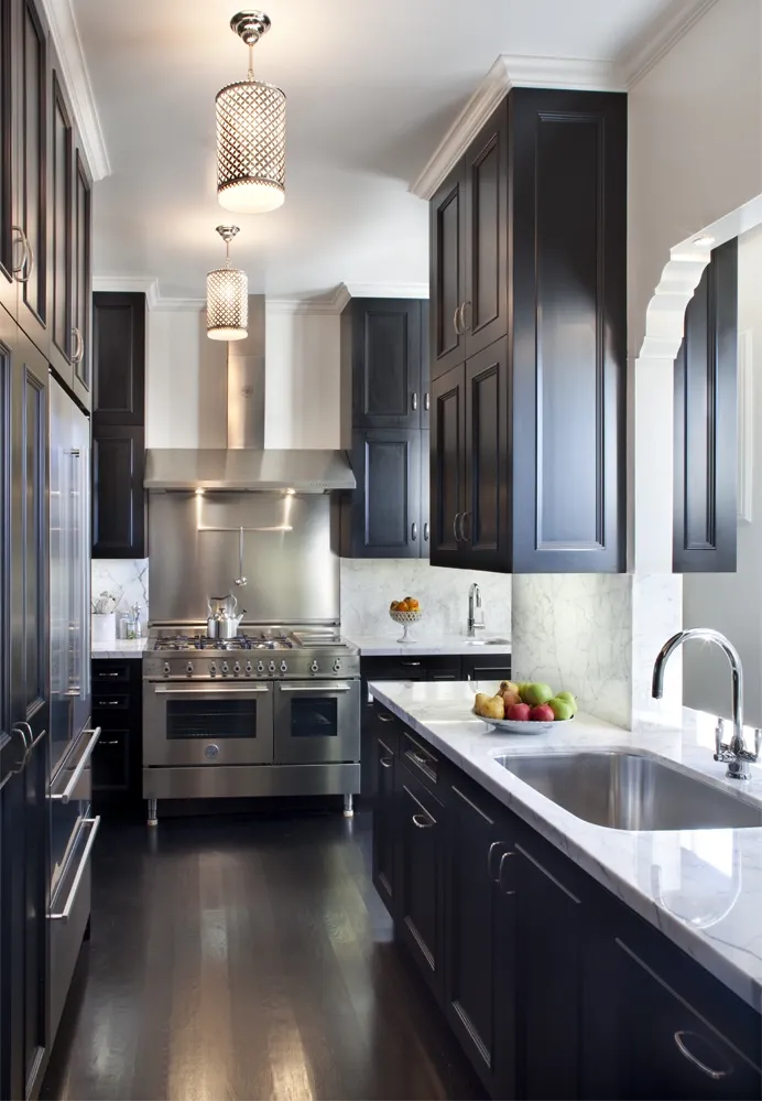
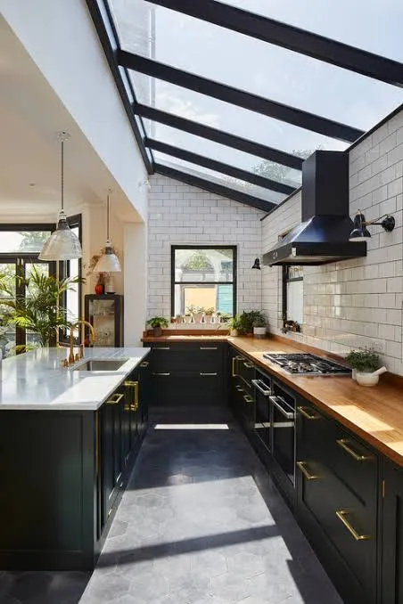
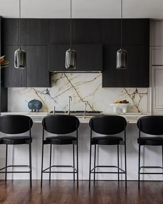
The Full Commit (All Black)
Painting all your cabinets black creates a serious statement. It wraps the room in drama. This works best if you have a lot of natural light. If your kitchen has one tiny window facing a brick wall, a full black kitchen might feel claustrophobic.
If you go this route, you must break up the heaviness with your countertops, backsplash, and flooring. You need those neutral elements to act as a breath of fresh air.
Check Next:
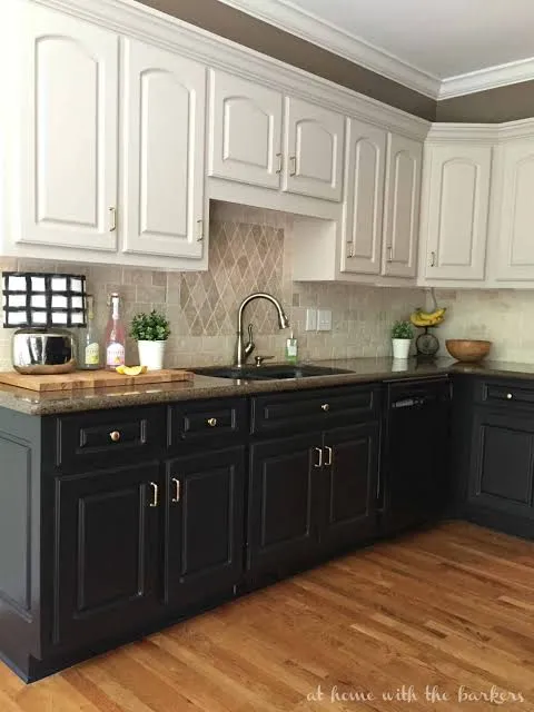
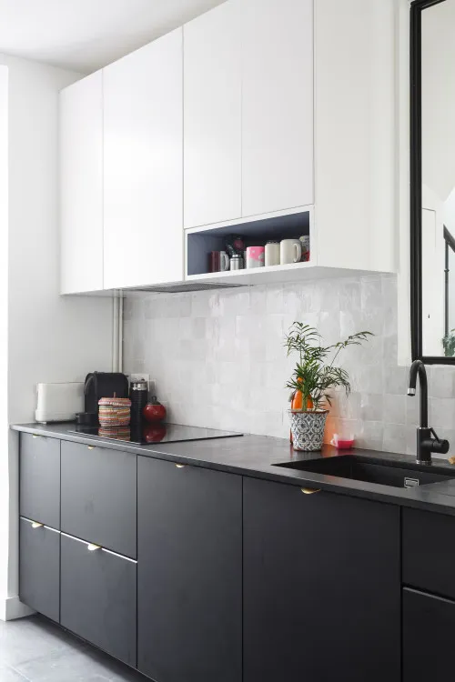
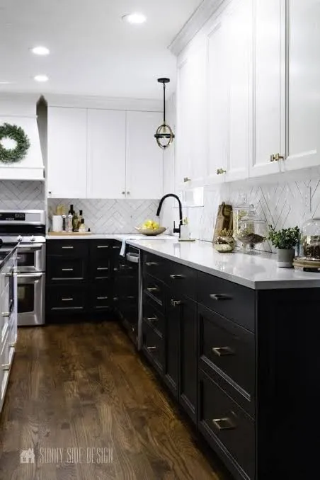
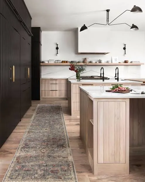
The Tuxedo Kitchen
This is my personal favorite. You paint the lower cabinets black (or a deep charcoal) and keep the upper cabinets a warm white or light neutral.
- Why it works: It grounds the kitchen without closing it in.
- The visual trick: Since the dark color sits below eye level, the room still feels airy and spacious.
- The practicality: The lowers take the most abuse (kicks, scuffs, spills), and the dark paint hides it all.
This approach offers the best of both worlds. You get the drama of the black and neutral kitchen trend without the commitment of a fully dark room.
Countertops: The Bridge Between Dark and Light
Your countertops act as the negotiator between your dark cabinets and your bright lighting. You want something that ties the two worlds together.
Avoid solid black countertops on black cabinets. Unless you are designing a nightclub, it’s too much. It absorbs all the light and makes food prep difficult. You want contrast here.
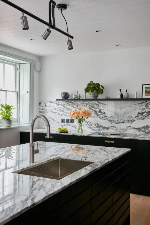
Marble and Quartz with Veining
I love a white quartz with heavy grey or black veining for this aesthetic. The background brightens the space, while the dark veins acknowledge the cabinets. It creates a cohesive story.
Look for materials that have movement. A static, solid white counter can look stark and cheap next to rich black paint. You want depth.
Butcher Block
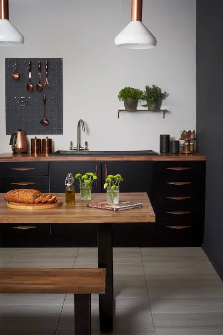
If you want to lean into the “neutral” side of the equation, wood countertops bring instant warmth. A rich walnut butcher block on top of matte black cabinets looks absolutely stunning. It feels organic and earthy. Just remember that wood requires maintenance. If you aren’t the type to oil your counters, stick to quartz that looks like stone.
Backsplash: Don’t Let It Compete
Here is a rule of thumb I live by: let one element be the star. If your cabinets are the main character, your backsplash should be the supporting actor.
The Zellige Tile Option
Handmade Zellige tiles are having a massive moment, and for good reason. They reflect light beautifully because of their uneven texture. A creamy white or “natural” Zellige backsplash adds texture without adding visual clutter. It keeps the palette neutral but interesting.
The Slab Backsplash
If the budget allows, run your countertop material up the wall. This creates a seamless, luxurious look. It reduces grout lines (cleaning win!) and keeps the visual noise to a minimum. Simplicity is key in a high-contrast kitchen. You don’t want a busy mosaic tile fighting for attention with your bold cabinets.
Warming It Up: The “Neutral” Part of the Equation
If you just paint everything black and white, you risk your kitchen looking like a chessboard. You need warmth. You need texture. This is where the “neutral” part of “Black and Neutral” comes into play.
Wood Tones are Non-Negotiable
You absolutely need wood in this kitchen. It connects the design to nature.
- Flooring: A light European oak floor prevents the room from feeling too dark.
- Shelving: Swap out a few upper cabinets for floating wood shelves. The wood tone breaks up the paint and adds a place to display cute ceramics.
- Accessories: Even a few large wooden cutting boards leaning against the backsplash make a huge difference.
The goal is to stop the room from feeling sterile. Black can feel cold; wood makes it feel like home.
Metals and Hardware
Chrome is fine, but it can feel chilly. Unlacquered brass or polished nickel brings the heat. The gold tones in brass pop incredibly well against black cabinetry. It’s like jewelry for your kitchen.
If you hate gold, try a matte black fixture on a white wall, or a polished nickel faucet. Just ensure your metals match the overall temperature of your palette.
Lighting: Do Not Ignore This
I cannot stress this enough: lighting creates the mood. In a dark kitchen, shadows are your enemy. If you don’t have enough light sources, your beautiful black cabinets will just look like dark voids.
Layer Your Lighting
- Task Lighting: You need under-cabinet lighting. It illuminates your workspace and highlights the backsplash.
- Pendants: Hang oversized pendants over the island. I love a woven rattan shade here—it adds another layer of neutral texture.
- Ambient Light: Install dimmable recessed cans. You want the option to go bright for cleaning and moody for dinner parties.
Bad lighting will ruin even the most expensive renovation. FYI, 3000K (warm white) bulbs are usually the sweet spot. Anything cooler (4000K+) makes your cozy black kitchen look like a dentist’s office :/
Styling: The Finishing Touches
You built the bones, now you need to dress them. Styling a high-contrast kitchen requires restraint. You don’t want clutter, but you don’t want emptiness either.
Texture Over Color
Instead of adding bright red appliances or colorful art, play with texture.
- Textiles: A vintage runner rug with faded charcoal and beige tones looks amazing on a wood floor. It softens the acoustics and adds pattern.
- Ceramics: Display handmade pottery in creams, greys, and terracottas.
- Greenery: A massive vase of branches or a potted olive tree brings life to the space. The green pops vividly against the black background.
Keep your countertops mostly clear. The contrast itself is the decoration. You don’t need a bunch of knick-knacks cluttering up the view.
Common Mistakes to Avoid (Learn From My Failures)
I’ve seen a lot of DIY disasters, and I’ve caused a few myself. Here is how you avoid the “Pinterest Fail” result.
1. Ignoring the Floor Color
I mentioned this earlier, but it bears repeating. If you have dark floors and dark cabinets, you live in a cave now. Unless you have 20-foot ceilings and floor-to-ceiling windows, you need contrast between the floor and the cabinets. If you can’t change your dark floors, use a large, light-colored rug to break it up.
2. Picking the Wrong Grout
Do not use bright white grout with black tile unless you want a grid pattern burned into your retinas. Use a dark grey or black grout for a seamless look. Conversely, if you use white subway tile, a soft grey grout highlights the pattern without being jarring.
3. Forgetting About Dust
Here is the harsh reality: Black shows dust. It just does. If you put black quartz on your island, you will see every speck of flour. If you paint your lower cabinets black, you will see dust settle on the shaker trim.
Does this mean you shouldn’t do it? No. It just means you need to be realistic about your cleaning habits. If you are the type of person who loses their mind over a single speck of dust, maybe stick to a medium grey or wood tone.
4. Skimping on Samples
Never trust a paint chip. Paint a two-foot square on the wall. Watch it change throughout the day. I once painted a whole bathroom “black” only to realize it looked purple at 4 PM. It was tragic. Don’t be me.
Budget-Friendly Ways to Get the Look
You don’t need to gut your kitchen to get this vibe.
- Paint Your Existing Cabinets: It takes elbow grease, but it transforms the room for the cost of a few gallons of paint.
- Swap the Hardware: New knobs and pulls change the look instantly.
- Change the Faucet: A modern matte black or brass faucet updates the sink area.
- Add a Runner: A long rug adds that necessary texture and covers up ugly flooring.
Small changes add up. You can layer these updates over time.
Final Thoughts: Be Bold
The black and neutral kitchen trend isn’t going anywhere because it relies on fundamental design principles: contrast, balance, and texture. It pushes boundaries without screaming for attention.
So, pick up that paintbrush. Sample that scary shade of Onyx. You might feel nervous making the first stroke, but once you see how that deep color makes your white quartz pop and your brass hardware shine, you won’t look back.
Your kitchen should inspire you. It should be a place where you want to hang out, even when you aren’t eating. A high-contrast design does exactly that—it turns a utility room into a destination.
Now, go find the perfect black paint. Just remember to check the undertones first, okay? 🙂
What’s Next?
Did you find this guide helpful for your kitchen renovation plans? I can write a follow-up article focusing specifically on “The Best Black Paint Colors for Kitchen Cabinets (Reviewed)” or perhaps a guide on “Styling Open Shelving in a High-Contrast Kitchen.” Let me know which one you’d prefer