Picking a paint color for your kitchen cabinets feels like a massive commitment. What if you hate it? What if it looks great on the tiny swatch but absolutely monstrous on your actual cabinets?
And the biggest fear of all: what if you pick a color that actually tanks your home’s value when it’s time to sell? It’s a lot of pressure for a gallon of paint.
Let’s skip the decision paralysis. I’ve gone down the rabbit hole of trend reports and real estate data to bring you the definitive list of Kitchen Cabinet Paint Color Ideas that buyers actually love.
In This Article
- 1 The Value-Boosters: Colors That Make Buyers’ Wallets Open
- 2 1. Olive Green: The Unexpected Champion
- 3 2. Dark/Charcoal Gray: The Moody Masterpiece
- 4 3. Navy Blue: The Timeless Classic with an Edge
- 5 The Eternally Stylish: Timeless Colors for Safe, Chic Bets
- 6 4. Classic White: The Fail-Safe Favorite
- 7 5. Off-White & Cream: The Softer Side of White
- 8 6. Greige: The Perfect Hybrid
- 9 7. Sage Green: The Calming Earthy Tone
- 10
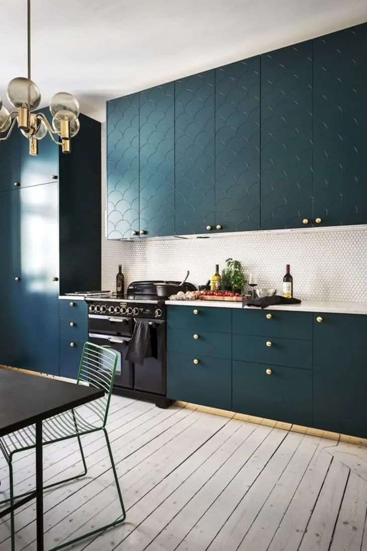
- 11 8. Deep Teal: The Jewel-Toned Beauty
- 12 9. Two-Toned Cabinets: The Best of Both Worlds
- 13 10. Muted Terracotta: The Earthy Warmth
- 14 11. Soft Black: The Ultimate Drama
- 15 The Colors of Caution: What to Avoid Like the Plague
- 16 The Final Brushstroke
The Value-Boosters: Colors That Make Buyers’ Wallets Open
These are the colors that the data says can literally make your home sell for more. If you’re painting with resale in mind, this is your starting lineup.
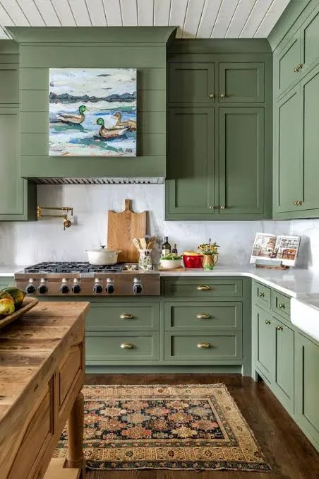
1. Olive Green: The Unexpected Champion
I’ll be honest, I did not see this one coming. But according to Zillow’s latest report, kitchens with olive green cabinets can sell for about $1,600 more than expected. How wild is that? This isn’t the funky avocado green of the 70s. Think of a deep, sophisticated, earthy olive that feels both modern and timeless.
It’s a color that connects to nature, which is a huge trend in interior design right now. It brings a sense of calm and grounding to a space.
- Vibe: Organic, sophisticated, and serene.
- Pairs beautifully with: White or cream countertops, wood accents, and brass or black hardware.
- My two cents: It’s a bold choice, but it pays off by making your kitchen look custom and high-end. It says you have style and confidence.
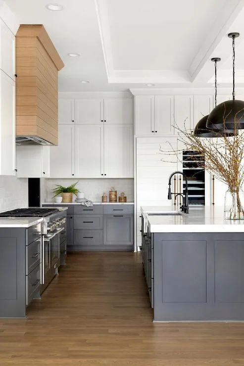
2. Dark/Charcoal Gray: The Moody Masterpiece
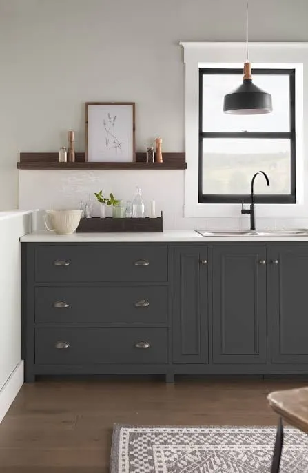
While olive green took the top spot for kitchens, dark gray was the king of living rooms, potentially adding a whopping $2,593 to a home’s value. That positive association definitely bleeds into the kitchen. A deep charcoal gray on cabinets is dramatic, grounding, and incredibly chic.
It’s a fantastic alternative if you want a neutral that has more depth and personality than white or beige. It provides a stunning contrast, especially in kitchens that get a lot of natural light.
- Vibe: Dramatic, modern, and luxurious.
- Pairs beautifully with: Marble or quartz countertops, a crisp white backsplash, and brushed nickel or gold hardware.
- My two cents: This color is perfect for creating a high-contrast, professional-grade look without being too loud.
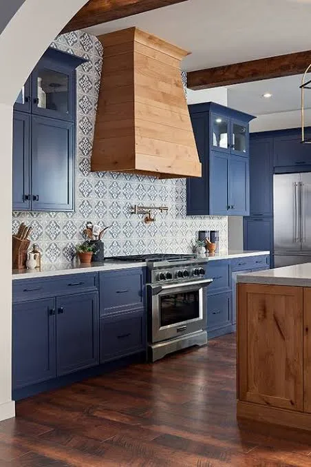
Navy blue has been a designer favorite for years, and for good reason. It’s a classic that never feels dated. While Zillow’s study highlighted navy in the bedroom (adding over $1,800 in value!), its appeal is universal. It’s a color that signifies elegance and tradition but still feels fresh.
Using navy on your cabinets—either all over or just on the lower cabinets or a kitchen island—creates a rich, expensive look.
- Vibe: Elegant, nautical, and bold.
- Pairs beautifully with: Bright white countertops, a simple subway tile backsplash, and shiny brass hardware for that perfect pop.
- My two cents: If you’re a little scared of black but want that dark, dramatic feel, navy is your perfect match. It’s color, but it acts like a neutral.
The Eternally Stylish: Timeless Colors for Safe, Chic Bets
Maybe you’re not painting to sell tomorrow. You just want a color that you’ll love for years and that won’t feel dated by next Tuesday. These are the tried-and-true classics that always work.
4. Classic White: The Fail-Safe Favorite
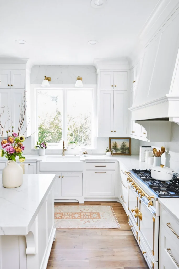
Okay, okay, I know. White? Groundbreaking. But hear me out. There is a reason why white kitchens are eternally popular. They are clean, bright, and make any space feel bigger and more open.
White is the ultimate blank canvas, allowing you to bring in color with your backsplash, decor, and appliances.
The key is picking the right white. Avoid anything too stark or cold. Look for whites with a soft, subtle undertone.
- Vibe: Bright, airy, and clean.
- Popular Choices: Benjamin Moore’s Simply White (OC-117) and Cloud Cover (OC-25) are designer go-tos.
- My two cents: It may feel “safe,” but a white kitchen will never be a mistake for resale. It gives buyers a blank slate they can envision themselves in.
5. Off-White & Cream: The Softer Side of White
If stark white feels a little too clinical for you, an off-white or creamy neutral is the perfect solution. These colors have warm undertones that create a much more inviting and cozier atmosphere. Think of it as a white kitchen with a built-in warm hug.
Check Next: Boho Kitchen Cabinets: Unique Colors, Finishes, and Styling Tricks
These shades are perfect for traditional, transitional, and modern farmhouse kitchens.
- Vibe: Warm, cozy, and inviting.
- Pairs beautifully with: Butcher block countertops, warm wood floors, and oil-rubbed bronze hardware.
- My two cents: It’s a subtle twist on the classic that makes a kitchen feel more lived-in and comfortable. Benjamin Moore’s Natural Cream (OC-14) is a fantastic option.
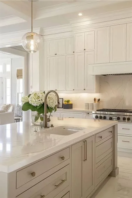
6. Greige: The Perfect Hybrid
Ever have trouble deciding between gray and beige? Well, why not both? 🙂 “Greige” is the ultimate neutral that has dominated interior design for the last decade. It takes the warmth of beige and blends it with the modern sophistication of gray.
The result is a chameleon color that works with almost any style and any lighting condition. It’s impossible to get this one wrong.
- Vibe: Warm, sophisticated, and incredibly versatile.
- Pairs beautifully with: Literally everything. That’s its superpower.
- My two cents: If you are terrified of picking the wrong undertone (e.g., a gray that looks blue or a beige that looks yellow), greige is your savior.
7. Sage Green: The Calming Earthy Tone
Before olive green stormed onto the scene, its softer cousin, sage, was the go-to green for kitchens. And it’s still a fantastic choice! Sage is a muted, grayish-green that feels very earthy and organic. It’s like bringing a little bit of nature right into your kitchen.
This color is known for its calming properties, creating a serene and peaceful environment to cook in.
- Vibe: Earthy, peaceful, and timeless.
- Pairs beautifully with: White or light wood countertops, creamy white walls, and black or nickel hardware.
- My two cents: Sage is a great way to add color that feels soothing rather than shocking. It has personality without being overwhelming.

For the Bold and the Brave: Just a Touch of Drama
This last set is for those who want to make a bit more of a statement. These might be a bit more taste-specific, but in the right kitchen, they are absolute knockouts.
8. Deep Teal: The Jewel-Toned Beauty
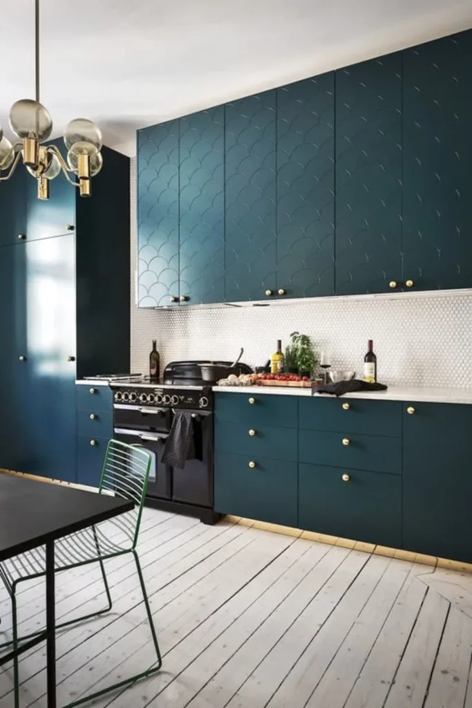
A deep, blue-green teal is a showstopper. It’s a rich, jewel-toned hue that feels both luxurious and playful. A former Benjamin Moore Color of the Year, Aegean Teal, is a perfect example of a sophisticated shade that works beautifully on cabinets.
- Vibe: Luxurious, unique, and full of personality.
- My two cents: This is a fantastic choice for a kitchen island to create a focal point without committing the entire room to such a bold color.
9. Two-Toned Cabinets: The Best of Both Worlds
Can’t decide on a single color? The two-toned look is your answer. This trend involves using one color for the upper cabinets (usually a light neutral like white or off-white) and a different, often darker or bolder color for the lower cabinets.
This is a brilliant strategy for several reasons:
- Grounds the space: The darker bottom cabinets anchor the room.
- Keeps it light: The white uppers keep the kitchen feeling bright and open.
- Lets you be bold: It’s the perfect way to incorporate a trendy color like navy or olive green without it overwhelming the space.
10. Muted Terracotta: The Earthy Warmth
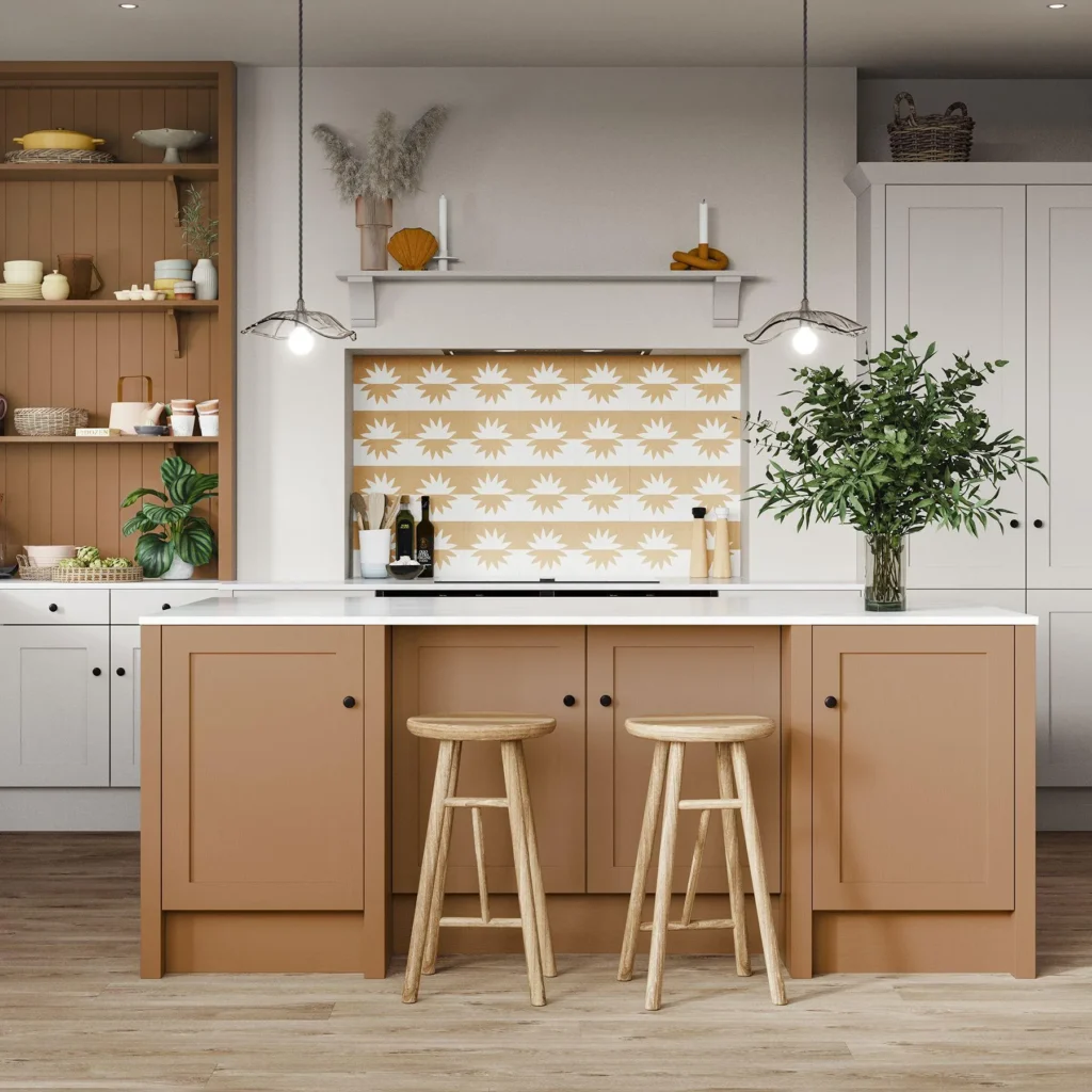
Inspired by sun-washed landscapes, muted terracotta and clay tones bring a natural, rustic warmth to a kitchen. These aren’t bright orange; think subtle shades of sandstone or dusky plum that feel both earthy and elegant. They create a cozy, inviting atmosphere that’s unique and stylish.
- Vibe: Rustic, warm, and natural.
- My two cents: This is a color that feels incredibly current and connected to the “organic modernism” trend Zillow mentioned.
11. Soft Black: The Ultimate Drama
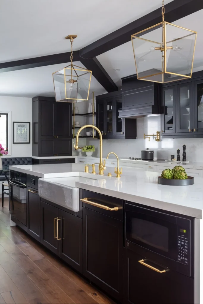
For the ultimate in drama and sophistication, you can’t beat black. A soft, matte black on kitchen cabinets creates a sleek, modern, and slightly edgy look that is undeniably cool. It’s like the little black dress of kitchen design.
- Vibe: Dramatic, sophisticated, and modern.
- Pairs beautifully with: Rich wood tones, bright white countertops, and metallic hardware to prevent it from feeling too heavy.
- My two cents: Like navy, a soft black can act as a neutral, providing a stunning backdrop for other elements in your kitchen to shine.
The Colors of Caution: What to Avoid Like the Plague
Now for the fun part. The Zillow report also told us which colors made buyers want to run for the hills (or at least, offer thousands of dollars less). Topping the “absolutely not” list?
- Daisy Yellow: A kitchen painted in a bright, sunny yellow could slash the sale price by nearly $4,000. Ouch.
- Fire-Hydrant Red: Similarly, a red kitchen was a major turn-off, potentially lowering offers by around $1,800 to $2,000.
The lesson here? While color is good, super-saturated, high-energy colors are extremely personal and a huge gamble for resale. FYI, unless you plan on staying in your home forever, it’s best to steer clear of the McDonald’s-themed palette.
The Final Brushstroke
So there you have it. Picking a cabinet color doesn’t have to be a panic-inducing nightmare. Whether you go with a data-backed value-booster like olive green or a timeless classic like a creamy white, the right color is out there.
The most important thing is to create a space that feels cohesive, intentional, and, most importantly, feels like you… while also keeping a savvy eye on what future buyers might love.
So go grab those paint swatches with confidence. Your dream kitchen—and that extra home value—is just a brushstroke away. You’ve got this