Staring at tile samples until your eyes cross? I’ve been there. You want a kitchen that looks amazing now and ten years from now, not a trendy disaster that ages like milk. Let’s cut the noise and look at 12 Kitchen Tiles Backsplash combinations that actually survive the test of time.
In This Article
- 1 Why “Timeless” Actually Matters
- 2 1. Classic White Subway Tile + Charcoal Grout
- 3 2. Carrara Marble Slab + Warm Walnut Cabinetry
- 4 3. Handmade Zellige Tiles + Brass Hardware
- 5 4. Navy Blue Herringbone + White Quartz Counters
- 6 5. Soapstone Backsplash + Shaker Cabinets
- 7 6. Beadboard Paneling + Butcher Block
- 8 7. Tumbled Travertine + Oil-Rubbed Bronze
- 9 8. Black Slate + Open Shelving
- 10 9. Patterned Cement Tile + Concrete Counters
- 11 10. Penny Round Tiles + Glossy Colored Cabinets
- 12 11. Glass Sheet + Modern Minimalist
- 13 12. Exposed Brick + Stainless Steel
- 14 The “Boring” But Necessary Technical Stuff
- 15 1. Grout Is Not an Afterthought
- 16 2. Visual Chaos vs. Calm
- 17 3. Where to End the Tile
- 18 Final Thoughts on Choosing Your Combo
Why “Timeless” Actually Matters
We need to get real for a second. Renovating a kitchen costs a fortune. Ripping out a backsplash because you chose a weird neon geometric shape that was “cool” in 2024 hurts your wallet and your soul. You want a backdrop that adapts as your style changes.
I define “timeless” as materials that rely on natural elements, classic shapes, or neutral palettes. These combinations allow you to swap out accessories or paint colors without forcing a full demolition.
1. Classic White Subway Tile + Charcoal Grout
People love to hate on subway tiles. They call them “basic” or “boring.” Ignore those people. White subway tile is the white t-shirt of kitchen design; it works with absolutely everything.
The secret to keeping it from looking like a public restroom lies in the grout. Dark charcoal or black grout defines the shape of each tile and adds a graphic punch. This combination looks incredible in farmhouse kitchens or industrial lofts. Plus, dark grout hides grease splatters way better than white grout ever will.
- Why it works: High contrast creates visual interest without overwhelming the eye.
- Style Note: Use a matte finish tile rather than glossy for a more modern, sophisticated feel.
2. Carrara Marble Slab + Warm Walnut Cabinetry
If you hate scrubbing grout lines (who doesn’t?), this is your winner. Instead of small tiles, run a solid slab of Carrara or Calacatta marble right up the wall. It creates a seamless, luxurious look that screams high-end design.
Marble can feel cold, so you need to balance it. Pair that cool, gray-veined stone with warm walnut or white oak cabinets. The wood brings heat to the room, while the stone keeps things bright.
- Maintenance Reality: Marble is porous. You must seal it, or that tomato sauce splatter will haunt you forever :/
- Budget Tip: If a full slab kills the budget, look for large-format porcelain tiles that mimic the marble look.
3. Handmade Zellige Tiles + Brass Hardware
Zellige tiles are having a moment on Pinterest right now, but they have been around for centuries. These are handmade Moroccan clay tiles with uneven surfaces and chipped edges. They catch the light in a way that flat, machine-made tiles just can’t.
Must Check:
Go for a creamy white or soft gray Zellige backsplash. The texture does all the talking here. When you pair this rustic texture with unlacquered brass hardware, the kitchen feels established and organic. It looks like it’s been there for 50 years, in the best way possible.
- Texture: The irregular surface hides smudges and water spots.
- Installation: Warn your tiler beforehand; these tiles are thick and tricky to space evenly.
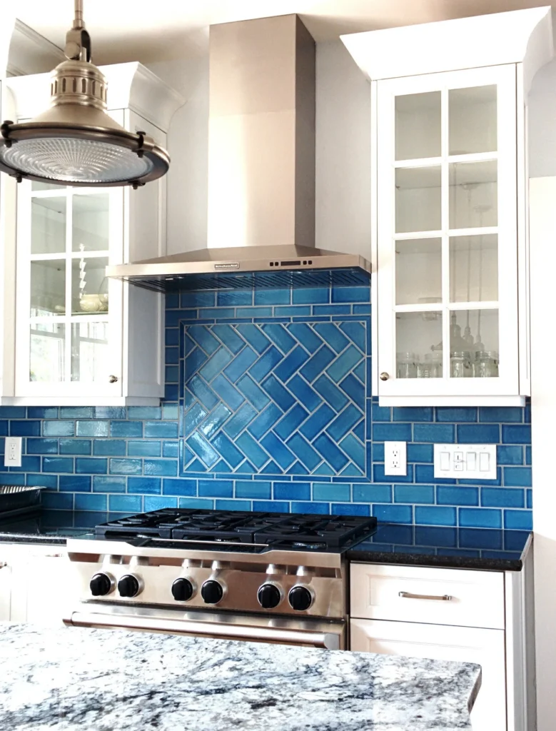
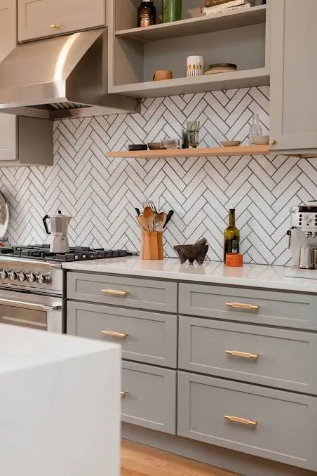
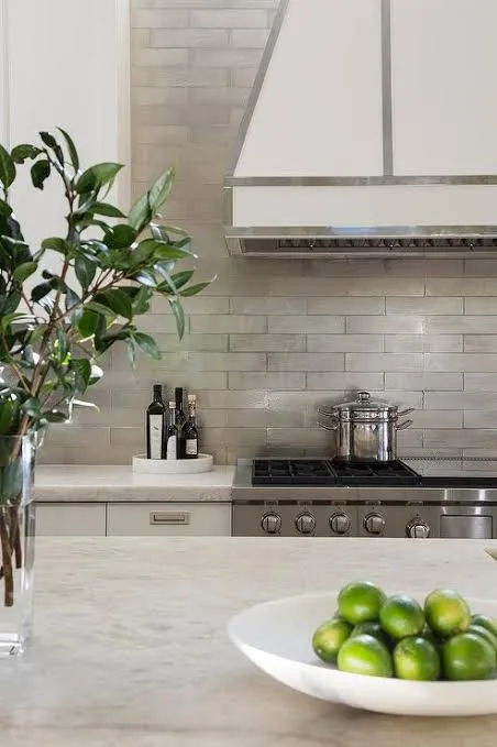
Who said timeless has to mean colorless? Navy blue functions as a neutral in the design world. It’s elegant, moody, and grounds a space.
Instead of a standard brick lay, arrange rectangular blue tiles in a herringbone pattern. This adds movement and energy to the walls. Contrast this dark, busy wall with clean, crisp white quartz countertops. The white surface reflects light up onto the dark tiles, making the blue pop even more.
- The Vibe: Nautical, preppy, yet undeniably modern.
- Lighting: Ensure you have good under-cabinet lighting, or the dark tile might create a “black hole” effect in the corners.
5. Soapstone Backsplash + Shaker Cabinets
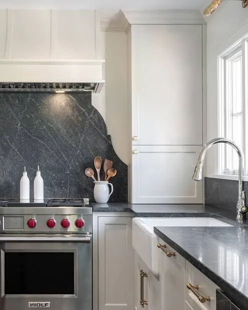
I absolutely love soapstone. It has this soft, powdery texture and a matte charcoal color that looks incredible in historic or cottage-style kitchens.
Run a short, 4-inch splash or a full wall of soapstone to match your counters. Pair this with classic Shaker-style cabinets painted in a soft mushroom or beige. This combination feels incredibly tactile and humble. It doesn’t shout for attention; it just quietly looks perfect.
Related:
- Durability: Soapstone is non-porous and withstands heat incredibly well.
- Aging: It develops a patina over time, darkening in spots you touch frequently. IMO, this adds character.
6. Beadboard Paneling + Butcher Block
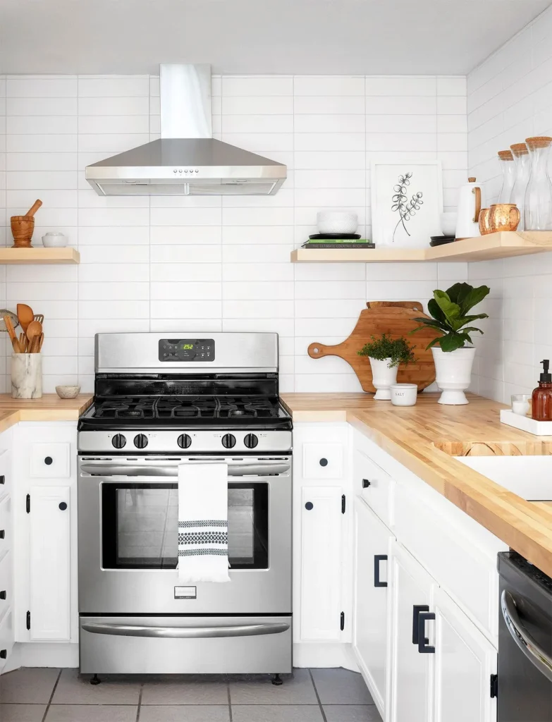
Sometimes the best tile isn’t tile at all. For a cozy, English cottage vibe, install vertical beadboard paneling. paint it in a soft sage green or a creamy off-white.
This pairs beautifully with butcher block countertops. The wood-on-wood aesthetic (even if the beadboard is MDF) creates a super cozy, approachable kitchen. This is also one of the cheapest backsplash options you can choose.
- Paint: Use semi-gloss or high-gloss paint on the beadboard so you can wipe it down easily.
- Warning: Avoid using wood directly behind a high-BTU gas range unless you check your local fire codes.
7. Tumbled Travertine + Oil-Rubbed Bronze
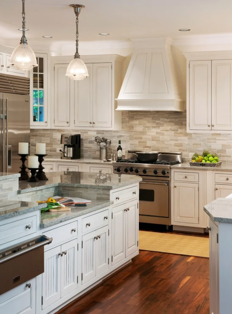
We all remember the Tuscan kitchen craze of the early 2000s, right? While the “grapes on vines” motif is out, the material itself—travertine—is back.
Choose a tumbled, light beige travertine in a simple running bond pattern. The stone feels earthy and solid. Pair this with oil-rubbed bronze faucets and pulls.
Check Next:
This combination works perfectly in Spanish Revival or Mediterranean-style homes. It brings warmth back into the kitchen after a decade of gray-everything.
- Color Palette: Stick to warm, sandy tones.
- Texture: Tumbled stone has pits and holes; ensure your installer fills them with grout, or they will collect tomato sauce.
8. Black Slate + Open Shelving
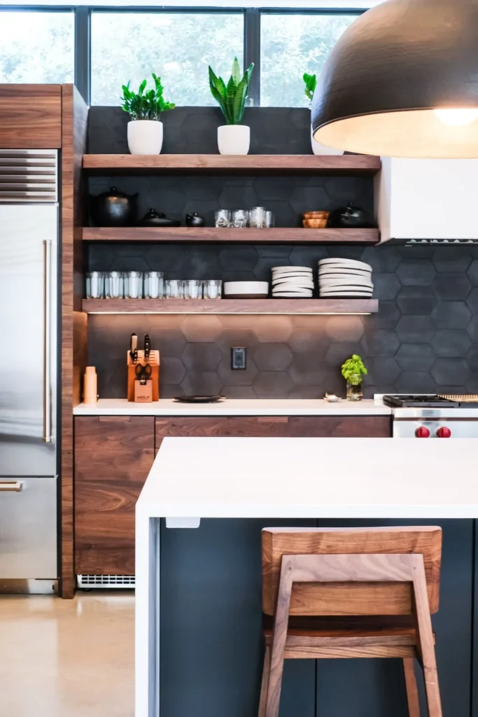
If you want drama, look no further. Black slate tiles (either large rectangles or squares) provide a matte, textured backdrop that looks stunning.
This dark wall is the perfect canvas for open wood shelving. Your white dishes and clear glassware will pop against the black background. It turns your kitchen storage into a display.
- Cleaning: Slate hides everything. Dust, crumbs, splashes—they disappear against the dark stone.
- Style: Works for rustic cabins, modern industrial, and Scandinavian designs.
9. Patterned Cement Tile + Concrete Counters
Cement tiles (also called encaustic tiles) offer bold, matte patterns. While wild colors might date the room, a black-and-white geometric cement pattern remains classic.
Pair these busy floors or walls with sleek gray concrete countertops. The solid, industrial nature of the concrete calms down the busyness of the tile pattern. It’s a balance of art and engineering.
- Sealing: Cement tiles are extremely porous. You must seal them heavily, or they will stain from a single drop of red wine.
- Visual Weight: Use the patterned tile on just one focal wall so the room doesn’t feel chaotic.
10. Penny Round Tiles + Glossy Colored Cabinets
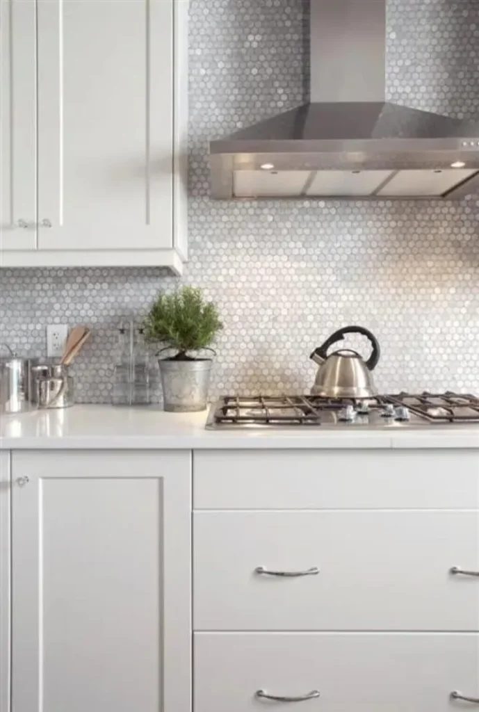
Penny rounds are those cute, tiny circular tiles usually found in bathrooms, but they look adorable in kitchens too. Choose a white or cream penny round with a contrasting grout.
Because the tile texture is so busy and small-scale, pair it with slab-front, glossy cabinets. The smooth, reflective surface of the cabinets contrasts with the nubby texture of the penny rounds.
- Grout Ratio: You see a lot of grout with penny rounds. Pick a color you actually like, because it plays a huge role in the final look.
- Style: Retro-modern or Mid-Century Modern.
11. Glass Sheet + Modern Minimalist
For the ultra-modern enthusiasts, grout lines are the enemy. A back-painted glass sheet offers a sleek, reflective surface that is incredibly easy to clean.
Match this with handleless, flat-panel cabinetry. The light bounces off the glass, making small kitchens feel twice as big. You can choose any color for the glass, but a soft gray or white keeps it timeless.
- Hygiene: This is the most hygienic option on this list. No crevices for bacteria to hide.
- Installation: This requires a pro. Tempering and cutting glass around outlets is not a DIY job.
12. Exposed Brick + Stainless Steel
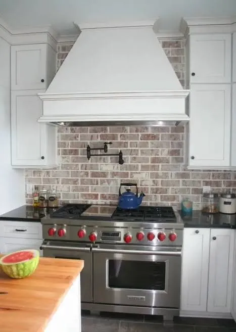
Do you have a loft or an older home? Expose that original red brick. If you don’t have real brick, buy high-quality brick veneer.
The rough, industrial red clay looks amazing against stainless steel appliances and countertops. It’s the ultimate “chef’s kitchen” vibe. The contrast between the rough, ancient brick and the sleek, sterile metal is design gold.
- Sealing: Brick absorbs grease like a sponge. Use a matte masonry sealer to protect it without making it look shiny and fake.
- Vibe: Urban, gritty, and warm.
The “Boring” But Necessary Technical Stuff
I know, talking about technical specs isn’t as fun as picking pretty colors. But if you ignore these three things, your beautiful backsplash will look trashy in six months.
1. Grout Is Not an Afterthought
Grout defines the pattern. White tile with white grout blends together for a texture-only look. White tile with dark grout creates a graphic pattern.
- My Advice: I always recommend an epoxy grout for kitchens. It resists stains and doesn’t crack as easily as standard cement grout. It costs more, but it saves you headaches later.
2. Visual Chaos vs. Calm
You have three main surfaces in a kitchen: Floors, Counters, Backsplash.
Pick one to be the star.
- If your granite counter looks like a tie-dye explosion, pick a plain subway tile.
- If your counter is plain white quartz, go crazy with a patterned cement tile.
- If you try to make everything the “star,” your kitchen will look like a clown exploded in it.
3. Where to End the Tile
This stumps everyone. Do you stop at the cabinet edge? Do you go to the ceiling?
Always tile to the ceiling around windows. It makes the room look taller and finishes the space. If you stop the tile halfway up the wall, it looks like you ran out of money.
Final Thoughts on Choosing Your Combo
Don’t stress too much about what the magazines say is “out.” If you love it, and it fits the architecture of your home, it works.
Start by grabbing physical samples of your tile. Tape them to the wall. Look at them in the morning light and the evening light. Does the white look yellow at night? Does the gray look blue? Trust your eyes, not the showroom lighting.
Go build that dream kitchen. Just please, for the love of design, seal your marble.
Are you leaning more towards the safe classic subway look, or are you tempted by the drama of the black slate? Let me know which combo sparked an idea for you!