Nobody wants to cook in a space that feels like a hospital operating room. The secret lies in layering. You need the right mix of texture, warmth, and sleek lines to make “simple” look expensive.
I’ve spent years obsessing over these details, and I’m telling you, the difference between “blah” and “breathtaking” is smaller than you think.
Here are 10 ways to nail that modern neutral aesthetic without putting your guests to sleep.
In This Article
- 1 1. Ditch the Stark White for “Greige” and Taupe
- 2 Why Warm Neutrals Work Better
- 3 2. Embrace Flat-Panel (Slab) Cabinetry
- 4 The Cleaning Factor
- 5 3. Layer Textures to Avoid Boredom
- 6 How to Mix Materials
- 7 4. The Continuous Slab Backsplash
- 8 Why You Will Love It
- 9 5. Hide the Hardware (or Make it Matte)
- 10 Picking a Finish
- 11 6. Warm It Up With Wood Accents
- 12 Strategic Wood Placement
- 13 7. Statement Lighting with Organic Shapes
- 14 Materials Matter
- 15 8. The “Appliance Garage” & Hidden Tech
- 16 Panel-Ready Appliances
- 17 9. Waterfall Island Edges
- 18 Durability Bonus
- 19 10. Minimalist Flooring Choices
- 20 Wide Plank Wood
- 21 Large Format Tile
- 22 Final Thoughts: Simplicity requires Discipline
1. Ditch the Stark White for “Greige” and Taupe
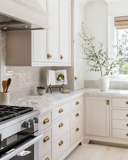
For a long time, the “all-white kitchen” reigned supreme. We painted everything Chantilly Lace and called it a day. But frankly, keeping an all-white kitchen pristine is a nightmare. Have you ever tried to keep white cabinets clean with kids or pets in the house? It’s an impossible battle.
Warmer tones are taking over. We are seeing a massive shift toward “greige” (gray + beige), taupe, and soft mushroom colors. These shades reflect light beautifully but offer much more depth than standard white.
Why Warm Neutrals Work Better
- They hide grime: A soft taupe hides fingerprints way better than bright white.
- They feel cozy: Stark white feels cold; earthy neutrals feel inviting.
- They pair with everything: These shades play nice with both gold and silver hardware.
My advice? Test your paint samples at different times of the day. A color that looks like the perfect sandy beige at noon might turn pink under your evening pot lights. Always test before you commit.
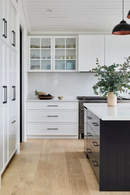
2. Embrace Flat-Panel (Slab) Cabinetry
If you want sleek, you have to rethink your cabinet doors. Shaker cabinets held the crown for decades, and they are lovely for a farmhouse look. But for a truly modern vibe, flat-panel or “slab” doors are non-negotiable.
This style eliminates the recessed panel found in traditional cabinetry. You get a smooth, unbroken surface that visually expands the room. It creates a continuous flow that makes even small kitchens feel massive.
The Cleaning Factor
Let’s be honest for a second. Cleaning the dust out of the corners of Shaker cabinets is the worst chore in the kitchen. With flat panels, you just wipe the surface down. Done.
If you worry that flat panels look “cheap” or unfinished, focus on the finish. A high-quality matte finish or a natural wood grain veneer looks incredibly high-end. Avoid high-gloss finishes unless you enjoy Windexing your cabinets every three hours.
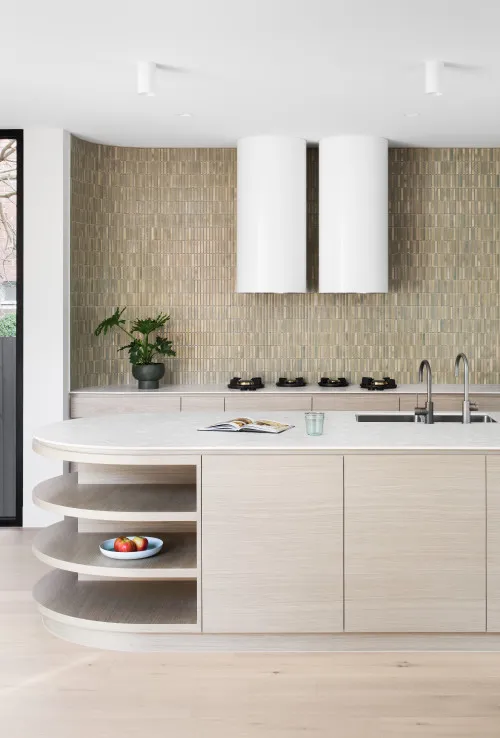
3. Layer Textures to Avoid Boredom
This is the most critical rule of neutral design. When you remove color, texture becomes your new best friend. If your walls, cabinets, and counters are all smooth and beige, your kitchen will look flat. You need friction. You need contrast.
How to Mix Materials
- Ribbed Glass: Use fluted or ribbed glass on upper cabinets to add a linear texture that catches the light.
- Plaster Hoods: Swap a stainless steel range hood for a custom drywall or plaster hood. The rough, matte texture adds instant character.
- Rugs and Runners: Throw down a vintage runner or a jute rug. It softens the hard lines of the cabinetry.
I recently saw a kitchen that paired smooth matte putty cabinets with a rough-hewn limestone backsplash. The color was identical, but the texture difference made it look architectural and expensive. IMO, texture is the only thing saving neutral kitchens from looking like generic builder-grade boxes.
4. The Continuous Slab Backsplash
Subway tiles had their moment. We all loved them. But if we are aiming for “sleek,” those hundreds of little grout lines are just visual clutter. The ultimate modern move is the slab backsplash.
This involves taking the same stone (quartz, marble, or quartzite) you used for your countertops and running it straight up the wall to the cabinets. It creates a seamless, vertical flow that draws the eye up.
Why You Will Love It
- Zero Grout: No more scrubbing spaghetti sauce out of white grout lines.
- Luxury Look: It mimics the look of high-end hotels and luxury condos.
- Visual Calm: It quiets the space down immediately.
Is it more expensive than tile? Usually, yes. You have to buy more slabs. But if you have a smaller kitchen, the square footage might be low enough to make it feasible. If the budget is tight, just run the slab up 4–6 inches for a short backsplash and paint the rest of the wall. It still looks cleaner than tile.
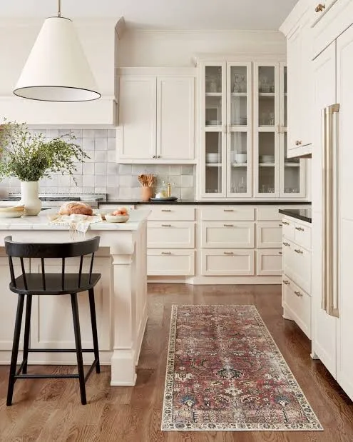
5. Hide the Hardware (or Make it Matte)
Hardware is often called the jewelry of the kitchen. But sometimes, you don’t need jewelry. You need a clean silhouette. Push-to-open cabinetry is gaining massive traction in modern design. You press the door, and it pops open. No knobs, no pulls, no visual interruption.
Check Next: 10 Warm Neutral Kitchen Ideas That Will Instantly Make Your Home Feel Cozier
If going completely handleless feels too robotic for you, choose sleek edge pulls. These mount to the top of the drawer or the side of the door and barely protrude.
Picking a Finish
If you do use visible hardware, keep the finish matte.
- Matte Black: Adds a graphic punch and grounds a light kitchen.
- Brushed Nickel: Disappears into gray or cool-toned cabinets.
- Aged Brass: Adds warmth to taupe or cream kitchens.
Avoid polished chrome or shiny gold. They tend to look too “glam” for a calm, neutral space. We are aiming for understated luxury, not a disco ball.
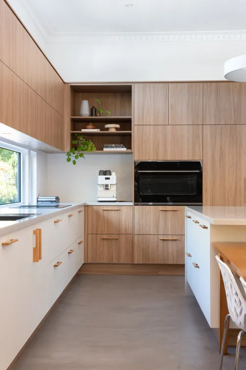
6. Warm It Up With Wood Accents
A neutral kitchen without wood risks feeling sterile. Wood brings in nature, warmth, and a sense of history. The key is to choose the right tone. For a modern aesthetic, stick to light-to-medium woods like White Oak, Ash, or lighter Walnut. Avoid the red/orange tones of cherry or mahogany, as they tend to date the space instantly.
Strategic Wood Placement
You don’t need a full wood kitchen to get the effect. Use wood as an accent:
- The Island: Paint the perimeter cabinets putty/greige and make the island white oak.
- Floating Shelves: Break up a wall of cabinets with two simple wood shelves.
- Bar Stools: Use wooden stools to warm up a stone island.
I love the combination of a cool gray cabinet with a warm oak floor. The contrast strikes a perfect balance. It tells the brain, “This is clean, but people actually live here.”
7. Statement Lighting with Organic Shapes
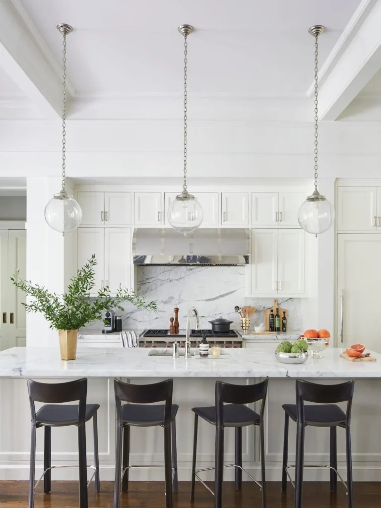
Since we aren’t using color to make a statement, we use lighting. Lighting fixtures in a neutral kitchen should act as sculpture. Oversized pendants are a fantastic way to create a focal point.
Look for shapes that feel organic rather than industrial. Think soft curves, domes, or irregular globes. Sharp angles can sometimes feel too harsh in a minimalist space.
Materials Matter
- Ceramic/Clay: A white plaster or ceramic pendant looks incredible against a stone backsplash.
- Woven: A rattan or woven pendant adds that necessary texture we talked about earlier.
- Smoked Glass: sleek and modern, but keeps the sightlines open.
Don’t be afraid to go big. A common mistake is hanging tiny pendants over a large island. It looks dinky. Scale up. Two large pendants look better than three small ones.
8. The “Appliance Garage” & Hidden Tech
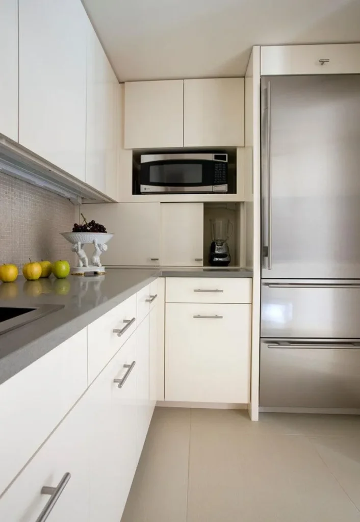
Clutter is the enemy of sleek design. You can pick the most beautiful quartz countertops in the world, but if they are covered in a toaster, a blender, and a coffee grinder, the look is ruined.
Enter the Appliance Garage. This is a dedicated cabinet that sits on the countertop. It usually has a lift-up door or pocket doors that slide back. You keep your coffee maker and toaster plugged in inside. When you need them, you open the garage. When you’re done, you close it.
Panel-Ready Appliances
Take this concept further by paneling your fridge and dishwasher. Most cabinet manufacturers offer panels that match your doors exactly. Your fridge just looks like a large pantry cabinet.
Does this cost extra? Yes. Is it worth it for the visual continuity? Absolutely. A giant stainless steel block breaks up the visual flow. Hiding it makes the kitchen feel more like a furnished room and less like a utility space.
9. Waterfall Island Edges
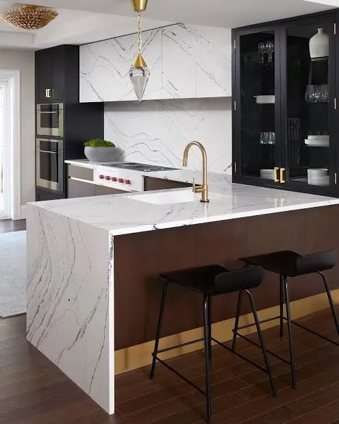
If you want to elevate your kitchen from “nice” to “magazine-worthy,” look at the waterfall edge. This is where the countertop material doesn’t just stop at the edge of the island; it turns a 90-degree angle and flows all the way to the floor.
It frames the cabinetry and showcases the beauty of the stone. Whether you choose a marble-look quartz or a solid color, a waterfall edge acts as a massive anchor for the room.
Durability Bonus
Aside from looking amazing, waterfall edges protect the side of your cabinets. If you have kids running around, scuff marks on the side of a painted island are inevitable. Stone doesn’t scuff. It handles the abuse of daily life much better than wood panels.
FYI: Make sure your fabricator matches the veins of the stone perfectly where the horizontal and vertical pieces meet. If the veins don’t line up, it looks like a mistake.
10. Minimalist Flooring Choices
Your floor is the largest surface area in the room. In a modern neutral kitchen, the floor should ground the space, not compete with it.
Wide Plank Wood
Wide plank European White Oak is the gold standard right now. The wider planks (7 inches or more) mean fewer seams, which tricks the eye into thinking the room is bigger.
Large Format Tile
If you prefer tile, go huge. 12×24 inch tiles are standard, but 24×48 inch tiles are better. Fewer grout lines equal a sleeker look. Look for a matte concrete-look porcelain tile. It’s indestructible and fits perfectly with the modern neutral vibe.
Avoid busy patterned tiles for the floor. Patterned encaustic tiles had a big moment a few years ago, but they visually shrink the room and lock you into a specific style. Keep the floor simple so your furniture and lighting can shine.
Final Thoughts: Simplicity requires Discipline
Creating a sleek, Modern Neutral Kitchen Design isn’t actually about what you add—it’s about what you take away. It requires the discipline to say “no” to the loud tile, the intricate hardware, and the clutter.
But don’t mistake “simple” for “easy.” It takes thought to balance these materials so they feel warm and inviting. Start with your palette, prioritize texture over color, and invest in storage that hides the mess. 🙂
Do you have a favorite neutral paint color, or are you still hunting for that perfect shade of greige? Let me know