We’ve all been there: clutching 25 “identical” white paint chips while your partner looks confused. You want timeless; they just see paint. The best news?
The stark “operating room” aesthetic is officially over. 2026 is all about warmth and depth—giving neutrals a soul instead of sterilizing them.
Whether you’re remodeling or doom-scrolling Pinterest at 2 a.m., let’s pick a Neutral Kitchen Colors palette that makes your kitchen look expensive and cozy, not like a regret waiting to happen.
In This Article
- 1 The Death of “Millennial Grey”
- 2 Meet “Mushroom”: The New King of Neutrals
- 3 Why It Works
- 4 Buttery Whites (No, Not Yellow)
- 5 How to Get It Right
- 6 Wood Is a Color (And It’s Everywhere)
- 7 The Two-Tone Strategy
- 8 The Rise of “Dark Neutrals”
- 9 Where to Use Dark Neutrals
- 10 Texture is the New Color
- 11 How to Bring Texture In
- 12 Greige: The Comeback Kid
- 13 Matching Metals to Your Neutrals
- 14 The Psychology of the 2026 Kitchen
- 15 Paint Finishes Matter
- 16 Testing Your Colors (Do Not Skip This)
- 17 A Note on Countertops
- 18 Conclusion: Trust Your Gut
The Death of “Millennial Grey”
I need to say this upfront: Cool-toned, flat grey is out. You know the one I mean. It dominated Instagram for a decade. It made every living room look like a black-and-white movie set.
In 2026, we crave warmth. We want kitchens that feel like a hug, not a sterile operating room.
If you paint your cabinets a chilly, blue-undertoned grey right now, you might regret it when you see the rich, earthy tones taking over the design world. The shift is subtle but significant. We are moving from “cool and sleek” to “warm and organic.”
Does this mean grey is forbidden? No. But the type of grey matters. We are swapping steel for stone.
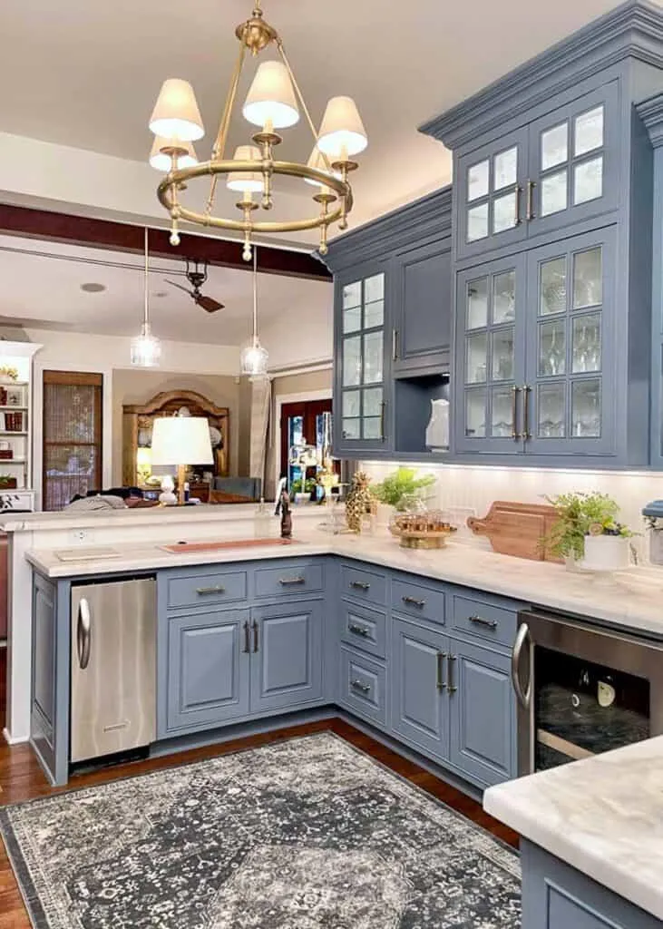
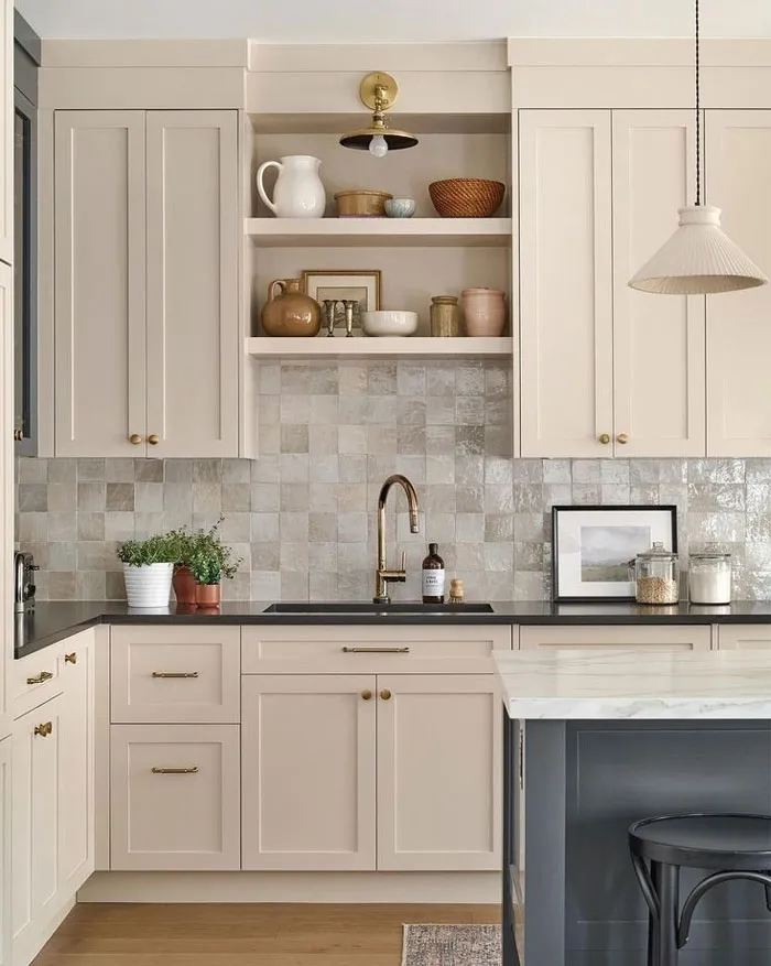
Meet “Mushroom”: The New King of Neutrals
If you take only one thing from this article, let it be this: Mushrooms are the color of 2026.
It sounds unappealing when you say it out loud (who wants a fungus-colored kitchen?), but visually, it is stunning. Mushroom, or “putty,” sits right in that sweet spot between grey and brown. It is essentially a beige that went to art school and learned how to dress better.
Why It Works
- Versatility: It pairs with chrome, brass, black, or copper hardware. It doesn’t fight with your metal finishes.
- Warmth: It reflects light in a soft, creamy way rather than bouncing harsh glare back at you.
- Timelessness: It feels historical and lived-in, not trendy or plastic.
I recently saw a kitchen with mushroom cabinets and unlacquered brass hardware, and honestly, I nearly cried. It was that beautiful. Look for colors like Sherwin Williams Shiitake or Benjamin Moore Revere Pewter (a classic for a reason) if you want to test this vibe.
Buttery Whites (No, Not Yellow)
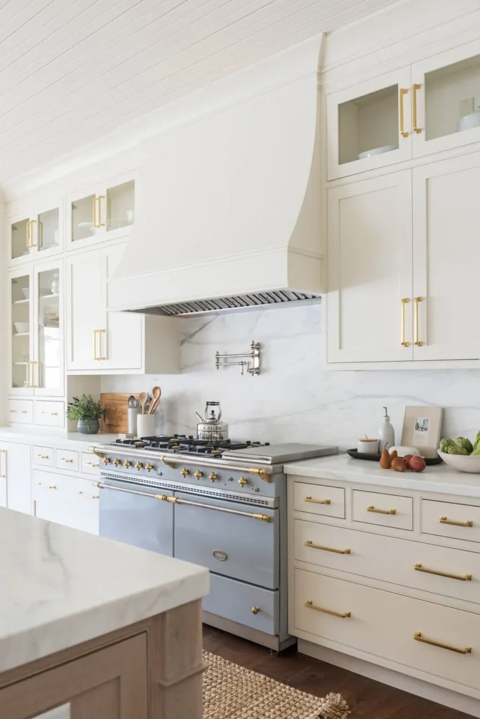
White kitchens will never truly die. They are the jeans-and-t-shirt of the design world. However, the shade of white is shifting drastically.
For a long time, we obsessed over “Chantilly Lace” and other ultra-bright, crisp whites. They look great in photos, but in real life? They can feel a bit clinical. The 2026 trend forecast predicts a massive surge in creamier, warmer whites.
Think less “sheet of paper” and more “whipped cream” or “white plaster.”
How to Get It Right
You have to be careful here. You don’t want a yellow kitchen that looks like it has been stained by cigarette smoke from the 1990s. The trick is finding a white with brown or grey undertones, not yellow ones.
- Greek Villa by Sherwin Williams: A solid choice that feels warm without turning yellow.
- Swiss Coffee by Benjamin Moore: A designer favorite that adds instant age and character to new cabinets.
Lighting is crucial here. If you use warm 3000K LED bulbs, these creamy whites will glow. If you use cool 5000K daylight bulbs, they might look muddy. FYI, always test your paint samples on the wall before committing.
Wood Is a Color (And It’s Everywhere)
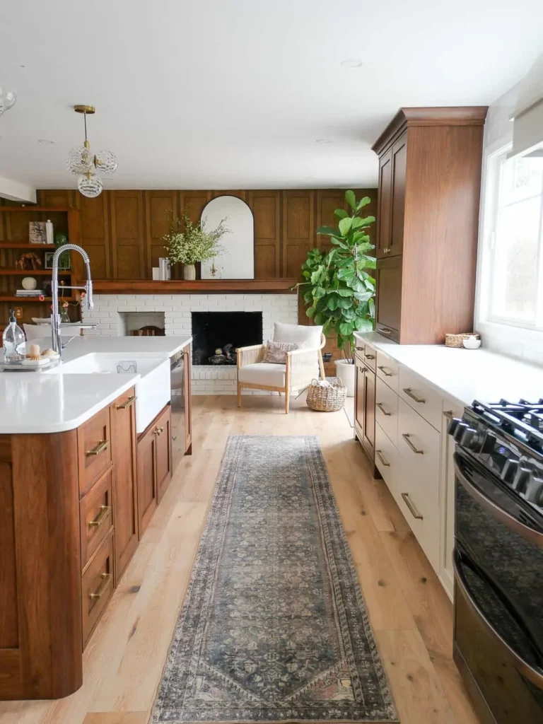
I’m counting wood as a neutral color because, in 2026, you will see it replacing painted cabinets entirely in many high-end kitchens.
We aren’t talking about the honey-oak cabinets from your childhood home that scream “1998 builder grade.” We are talking about White Oak and Walnut. The trend is leaning heavily toward matte, natural finishes where you can actually see the grain.
The Two-Tone Strategy
If a full kitchen of wood cabinets feels too rustic for you, mix it up. A popular layout I love involves:
- Creamy white upper cabinets to keep the room feeling tall and airy.
- Stained wood lower cabinets or island to ground the space and hide scuffs.
This combination offers the best of both worlds. You get the brightness of a white kitchen with the texture and warmth of a wood kitchen. Plus, wood lower cabinets hide dog nose prints way better than painted ones. Trust me on that one.
The Rise of “Dark Neutrals”
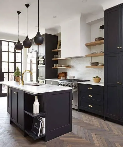
Who says neutral has to mean light? Dark colors are neutrals too, provided they aren’t vibrant. In 2026, we are seeing a move toward soft blacks, charcoals, and deep espresso browns.
Check Next: The Ultimate Lookbook: 12 Stunning Kitchen Island Countertop Ideas
This isn’t the harsh, glossy black of a bachelor pad. It’s a soft, matte black that almost looks like chalkboard paint. It adds drama without feeling gothic.
Where to Use Dark Neutrals
- The Island: Painting just your island a deep charcoal (like Benjamin Moore Cheating Heart) creates an amazing focal point.
- The Pantry: A small butler’s pantry painted entirely dark looks incredibly chic and moody.
- Window Trim: Black window sashes frame your view and make the outdoors pop.
I know darker colors can feel scary. You worry the room will feel small. But actually, dark colors recede visually, which can sometimes make walls feel further away. It’s a weird optical illusion, but it works.
Texture is the New Color
Okay, this sounds abstract, but stay with me. In 2026, “color” isn’t just about the pigment; it’s about the texture of the surface.
A flat beige wall is boring. A beige wall covered in limewash or Roman clay is a masterpiece. The movement and texture in the finish act as the “color.”
How to Bring Texture In
We are seeing a huge uptick in kitchens that skip the tile backsplash entirely. Instead, designers are running the countertop material (quartz, marble, or soapstone) right up the wall.
Alternatively, they are using Zellige tiles. These are handmade Moroccan tiles where no two pieces are exactly the same shade. Even if you choose white Zellige tiles, the variation in tone creates a shimmering, textured look that flat subway tile just can’t compete with. IMO, the standard subway tile is on its way out. It had a good run, but we need more character now.
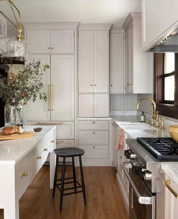
Greige: The Comeback Kid
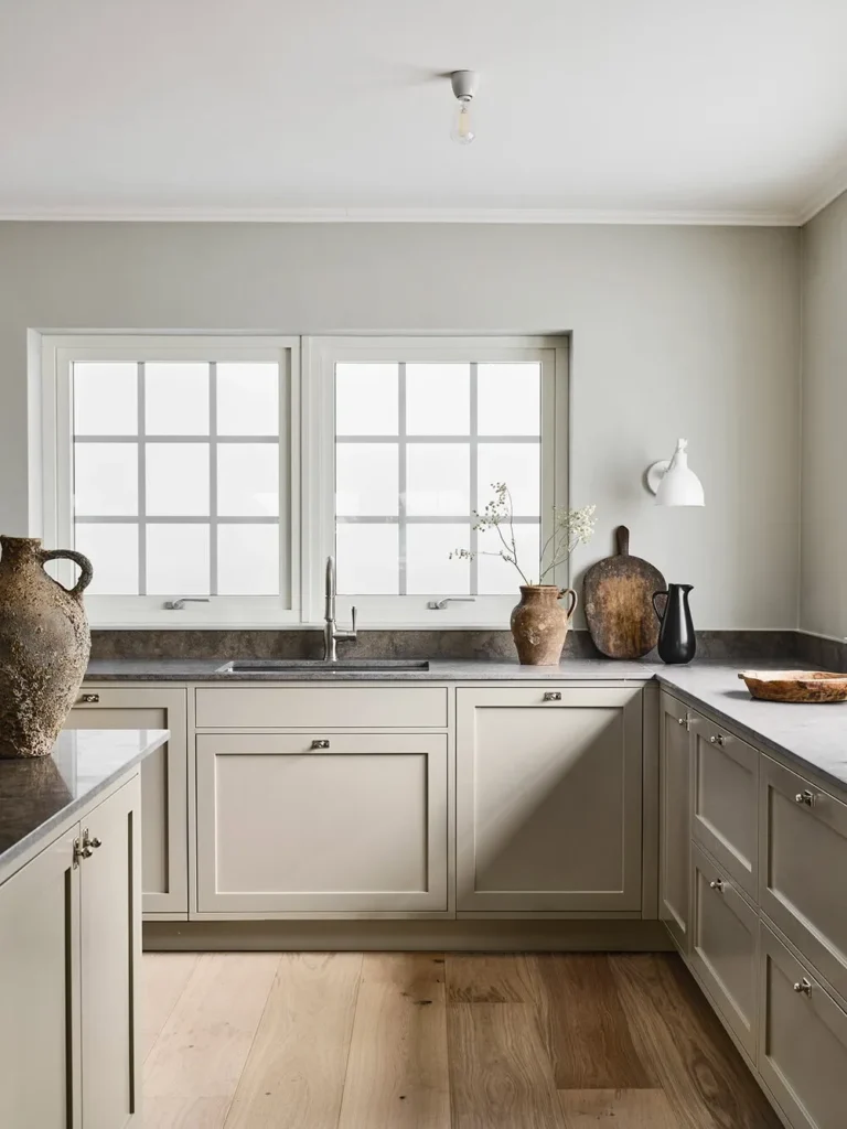
Wait, didn’t I just say grey was out? Yes. But Greige (Grey + Beige) is the survivor. It bridges the gap between the cool trends of the past and the warm trends of the future.
Greige is perfect if you have existing elements you can’t change. Maybe you have grey floors but want to warm up the walls. Greige ties them together. It is the diplomat of the color wheel.
Accessible Beige by Sherwin Williams is a staple here. It changes throughout the day. In the morning light, it might look grey. In the afternoon sun, it looks like a warm tan. That shifting quality keeps your kitchen feeling dynamic.
Matching Metals to Your Neutrals
You cannot pick a paint color without thinking about your hardware. They are a package deal.
- For Mushroom/Taupe Cabinets: Unlacquered brass or polished nickel looks incredible. The gold tones in brass pull out the warmth in the paint.
- For Warm White Cabinets: You can get away with almost anything, but Oil Rubbed Bronze provides a stunning, high-contrast look that feels very “modern farmhouse” (the evolved version, not the shiplap version).
- For Wood Cabinets: Matte black hardware looks modern and industrial, while chrome keeps it feeling fresh and clean.
Don’t match everything perfectly. Mixing metals is totally fine. I usually match the faucet to the cabinet hardware, but then use a different metal for the light fixtures. It makes the room look curated rather than bought from a catalog.
The Psychology of the 2026 Kitchen
Why are we shifting this way? Why the obsession with “warmth”?
Think about the world right now. It’s chaotic. It’s digital. We spend 12 hours a day staring at blue-light screens. When we walk into our kitchens to make coffee or cook dinner, we subconsciously crave the opposite of a screen. We want earth, stone, wood, and softness.
A sterile white kitchen feels like another screen. A warm, textured kitchen feels like nature. That is why these trends are sticking. They aren’t just aesthetic; they are emotional.
Paint Finishes Matter
You picked the perfect color? Great. Don’t ruin it by picking the wrong sheen.
For cabinets, the standard used to be semi-gloss because it’s durable. But in 2026, the trend is moving toward Satin or Eggshell finishes.
- Matte/Flat: Looks amazing and velvety, but a nightmare to clean grease off of. Avoid this for cabinets unless you never cook.
- Satin: The winner. It has a slight glow but hides fingerprints better than gloss.
- High Gloss: Only do this if you are going for a very specific, ultra-modern Euro look. Otherwise, it looks dated fast.
Testing Your Colors (Do Not Skip This)
I cannot stress this enough: Paint looks different in your house than it does on Instagram.
Your favorite influencer might have 20-foot windows and live in California. You might have one small window and live in Seattle. The same paint color will look completely different in those two spaces.
Here is my process for testing:
- Buy the peel-and-stick samples (Samplize is great).
- Stick them on the cabinet or wall.
- Look at them in the morning.
- Look at them at night with the lights on.
- Hold them next to your countertops and flooring.
If you skip this step, you are gambling with thousands of dollars. Don’t be that person. 🙂
A Note on Countertops

Since we are discussing neutral palettes, your countertop choice effectively serves as a large block of color.
Heavily veined marble (or marble-look quartz) is still popular, but we are seeing a shift toward softer, quieter stones. Soapstone is having a major moment. It’s black/grey, matte, and feels incredible to the touch.
If you go with “Mushroom” cabinets, a creamy quartzite countertop looks phenomenal. It keeps the contrast low and the vibe serene. Low contrast is a key theme for 2026. We aren’t doing the “black counters on white cabinets” zebra look anymore. We want a seamless flow.
Conclusion: Trust Your Gut
Trends are helpful guides, but they aren’t laws. If you absolutely love cool grey and it brings you joy, paint your kitchen cool grey. You are the one who has to drink coffee there every morning, not the internet police.
However, if you want a space that feels current, inviting, and ready for 2026, lean into the warmth. Embrace the taupes, the creamy whites, and the natural woods. Your kitchen should feel like the heart of the home, and these colors do exactly that.
So, grab a coffee, order some samples, and start planning. The sterile era is over. Let’s get cozy.